
A new look for the SIM card: Studio Blackburn unpack their brand for the ‘always on, never off’ rSIM
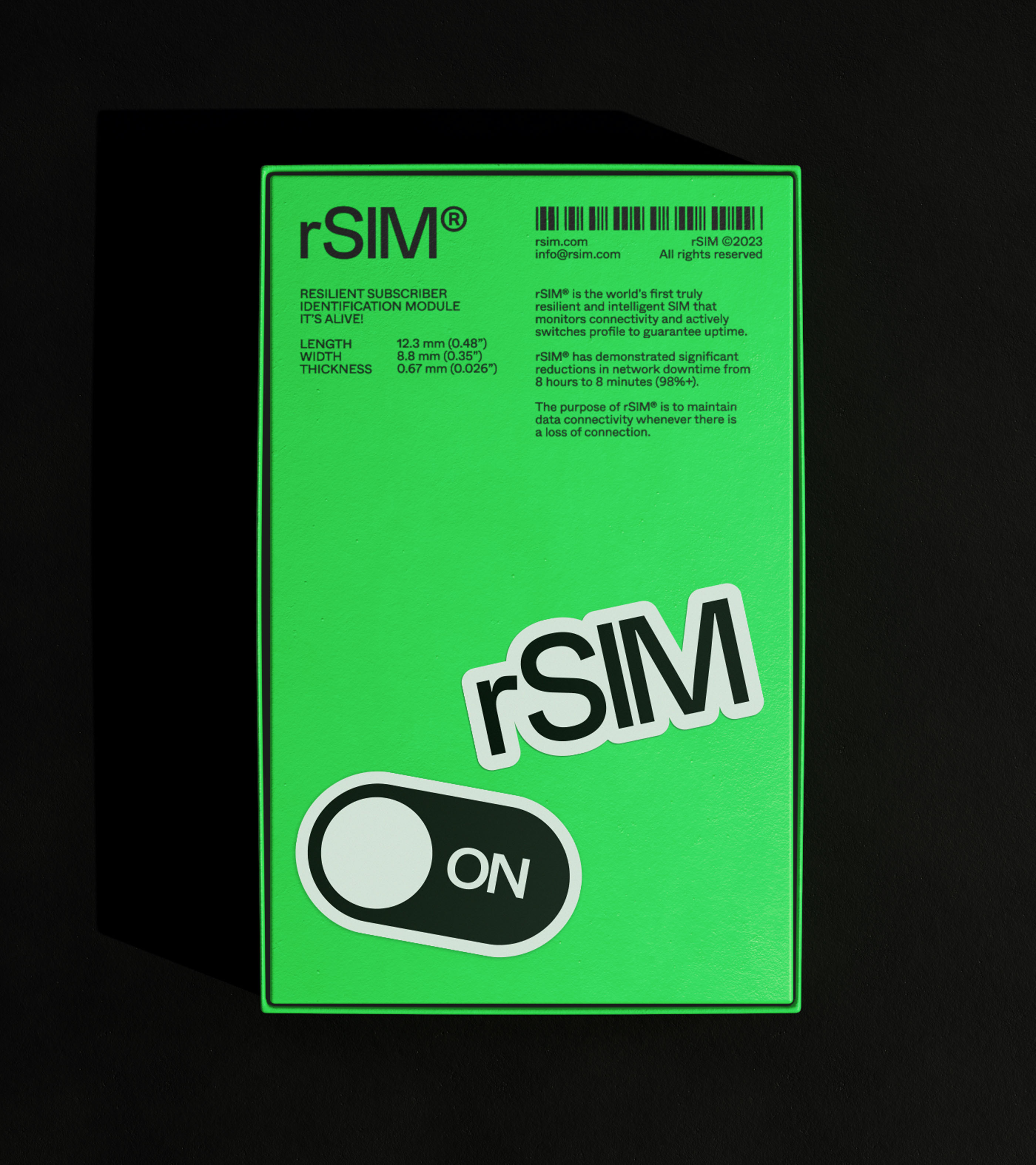
The SIM card is a ubiquitous little piece of design that feels like it’s been around for, well, forever. Yet, it hasn’t changed. That is, until rSIM had something to say. In an eye-catching neon hue, rSIM is a “resilient and intelligent sim card” that is able to monitor connectivity and actively switch between profiles to ensure ‘uptime,’ i.e. completely avoid any ‘downtime.’ Signal-hunters rejoice! “Resilience in technology basically means that it keeps doing what it is programmed to do no matter what you throw at it, which is integral for safety and security,” explains Mark Jones, Creative Director at the London-based Studio Blackburn, who took on the project of crafting rSIM’s identity. “Therefore, it was important for us to have a SIM card that looks rigid, robust and holds its shape.” Signalling the resilience of the product, the SIM is illuminated by a vibrant green colour. Inspired by ‘On’ buttons, lights and switches, the SIM is always ‘on,’ with the ‘On-On Switch’ as a key part of the brand.



More Featured Inspiration

Students From Media Design School Redesign Kupu to Drive Everyday Use of Te Reo Māori by Eilish Neal , Scarlett Kang , Jayme Ducommun , Mehmet Gultekin , Jules Castillon

How Studio Dial turns tactile generative experiments into brand tools by Studio Dial

Fello by Bold Scandinavia

Ascent by Visual Journal Selection

Butterfly Cannon Blends the Worlds of Fine Wine & Whisky, With Their Creation of Glenmorangie’s Wine Cask Collection by Butterfly Cannon

Saxon Campbell on why side projects let designers be beginners again by Independent Studio
Looking to build an iconic brand identity or packaging?
US BRANDING STUDIO collaborates with ambitious founders, startups, and luxury brands to design distinctive visual identities, bespoke typography, packaging systems, and comprehensive design languages.