
Daily Dialogue combine functional minimalism with nature in their lunar identity for ROOTINE
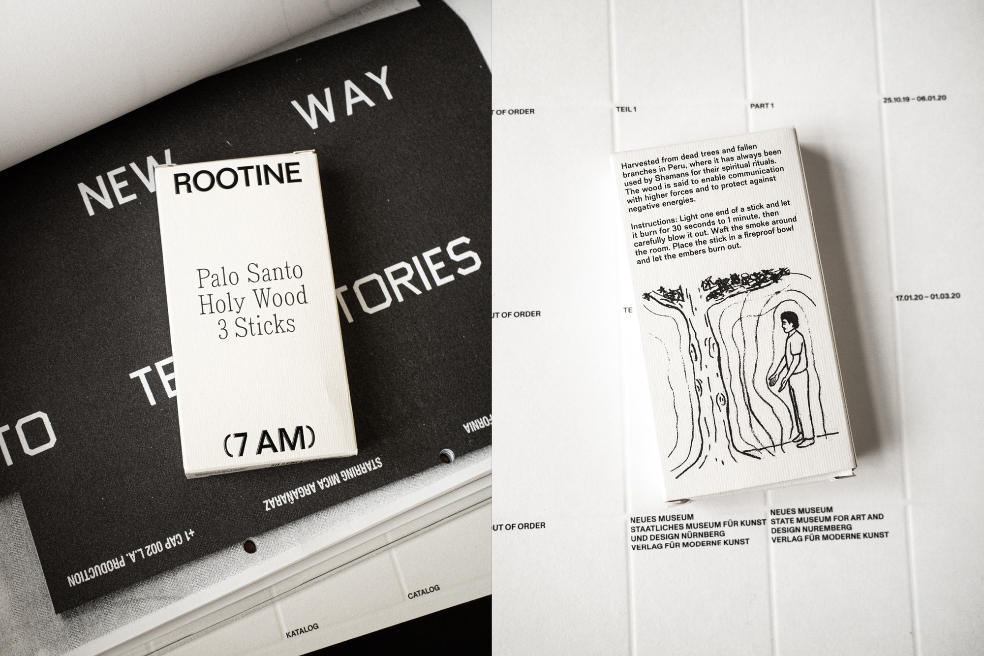
Based in Germany, ROOTINE is a “friendly, uplifting brand for discerning people” that provides a series of products created with the “highest quality and functional, natural design” in mind. Their offering is divided into three categories (JUICE), (7AM) and (UPGRADE), with each existing in dedication to “the continuous creation of a holistic, high-vibration lifestyle.” Perhaps the most straightforward, and the first product ROOTINE created upon their 2017 origin, (JUICE) is a range of natural, seasonal, organic juice shots that are cold-pressed in Munich. The brand moves in a more abstract direction with (7AM), which ROOTINE describe as “our powerful time of day,” in which meditation, thinking and the awakening of the mind take place. In the form of a tangible product, (7AM) manifests as a pack of three ‘Holy Wood’ incense sticks. (UPGRADE) functions as a line of “100% natural upgrades for your everyday life,” including an 8% Austrian CDB oil and gut-benefitting ‘Super Biotics’. Tasked with uniting ROOTINE’s three distinctive subbrands within a singular visual identity, Munich-based creative consultancy Daily Dialogue has devised a functional yet wonderfully elegant typographic system consisting of two contrasting typefaces.


More Featured Inspiration

Students From Media Design School Redesign Kupu to Drive Everyday Use of Te Reo Māori by Eilish Neal , Scarlett Kang , Jayme Ducommun , Mehmet Gultekin , Jules Castillon

How Studio Dial turns tactile generative experiments into brand tools by Studio Dial

Fello by Bold Scandinavia

Ascent by Visual Journal Selection

Butterfly Cannon Blends the Worlds of Fine Wine & Whisky, With Their Creation of Glenmorangie’s Wine Cask Collection by Butterfly Cannon

Saxon Campbell on why side projects let designers be beginners again by Independent Studio
Looking to build an iconic brand identity or packaging?
US BRANDING STUDIO collaborates with ambitious founders, startups, and luxury brands to design distinctive visual identities, bespoke typography, packaging systems, and comprehensive design languages.