
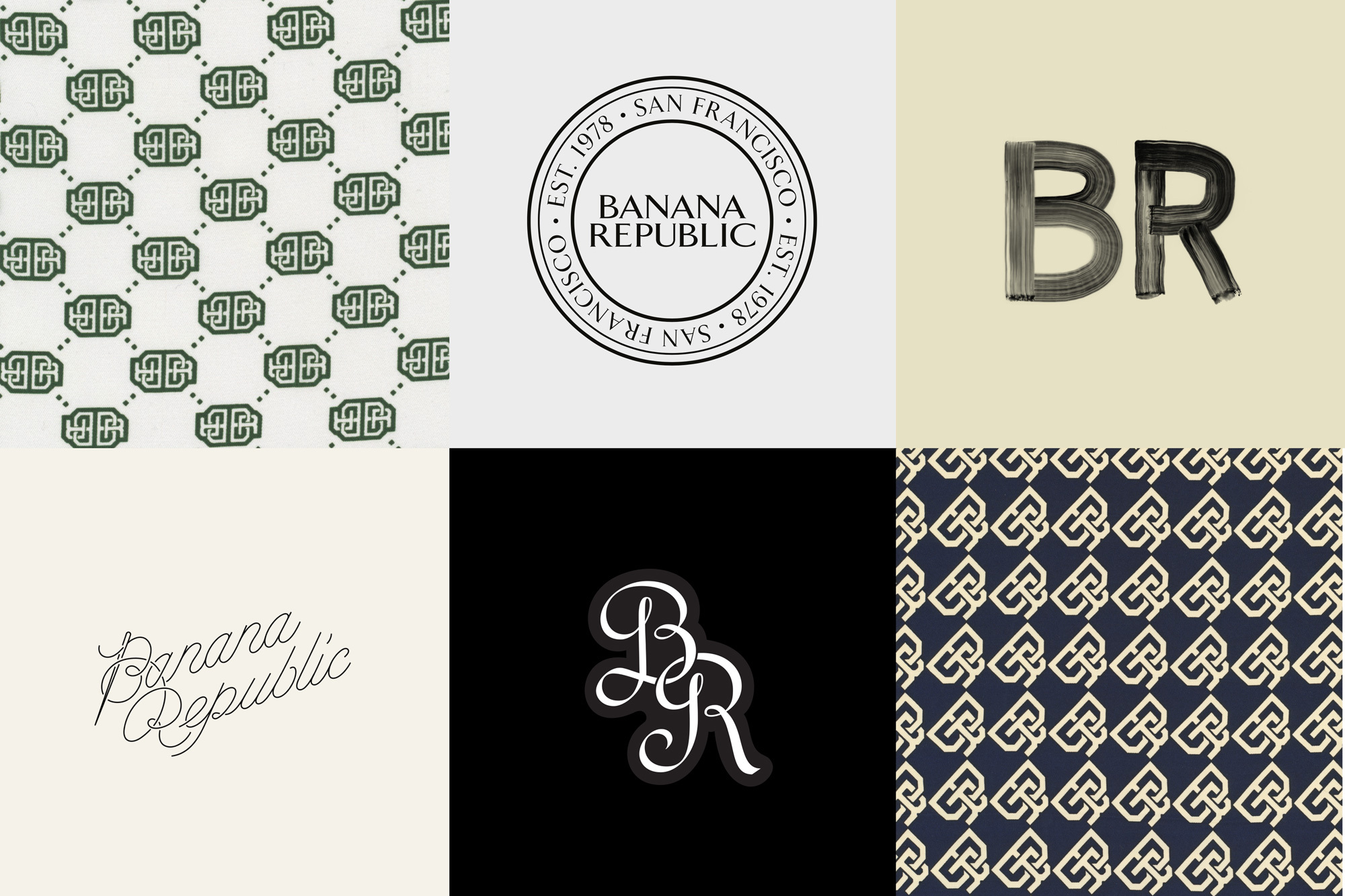
Decade revitalise Banana Republic’s brand with an elegant, eclectic and type-driven identity system
With Banana Republic holding such a valued and beloved status as a home for upscale fashion, it’s only fair that Decade’s brand revamp pays homage to the company’s heritage. In 2021, the New York-based studio worked closely with Banana Republic’s leadership and in-house design team to refresh the iconic American brand. The starting point was found in the letterforms of the original logo. As Decade Co-founders and Creative Directors Grace Robinson-Leo and Rob Matthews explain further, "through our research, we found that the logo was based on Arrow by Walter Diethelm (1965), stretched to be a bit wider.” This Arrow font was the basis of sketches for a potential custom typeface, and after receiving the client’s approval, Decade worked closely with Colophon Foundry to craft a bespoke serif. Taking the logo and Arrow as inspiration, Colophon Foundry explain the development process. “We started by matching the weight of the type and logomark and borrowed key forms such as the ‘R’ and ‘P.’ From here, we used variable type to establish the right balance between contrast, serif length and height and expand it into a usable typeface that would compliment rather than replicate the wordmark.” The resulting type system carries the same aesthetic and presence as the mark yet, with two optical sizes – Display and Text – can be used across a multitude of applications.


More Featured Inspiration

Students From Media Design School Redesign Kupu to Drive Everyday Use of Te Reo Māori by Eilish Neal , Scarlett Kang , Jayme Ducommun , Mehmet Gultekin , Jules Castillon

How Studio Dial turns tactile generative experiments into brand tools by Studio Dial

Fello by Bold Scandinavia

Ascent by Visual Journal Selection

Butterfly Cannon Blends the Worlds of Fine Wine & Whisky, With Their Creation of Glenmorangie’s Wine Cask Collection by Butterfly Cannon

Saxon Campbell on why side projects let designers be beginners again by Independent Studio
Looking to build an iconic brand identity or packaging?
US BRANDING STUDIO collaborates with ambitious founders, startups, and luxury brands to design distinctive visual identities, bespoke typography, packaging systems, and comprehensive design languages.