
Decade’s identity for workwear brand Argent utilises their innate vibrancy and refined subtlety
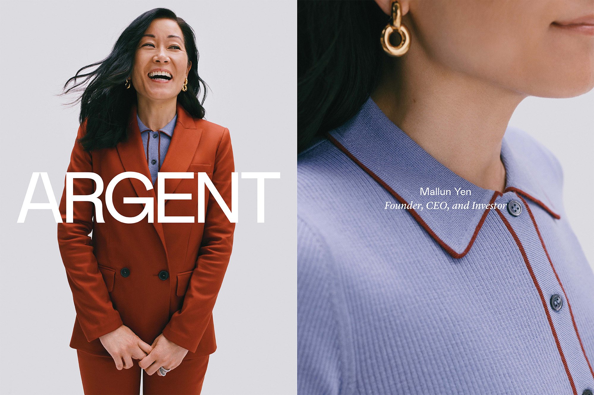
New York-based design agency Decade have spent 2020 rebranding women’s workwear brand Argent, which produces pieces that give a contemporary take on workwear – modern workwear for the modern work environment. Creating clothes that have a genuine consideration for functionality, such as actually having pockets, Argent needed a new identity that reflected this discernment and forward-thinking attitude. With a total overhaul of the brand, Decade have worked closely with Argent in crafting a new visual identity alongside a fresh creative direction and marketing material – all produced with a mindset as progressive as the brand itself, designed to be adaptable, flexible and future-focused. “We drew the logo mark to have a nod to Argent’s previous brand identity,” Decade recall, “which had a theme of a forward slash to reference the office and technical writing.” Feeling slightly clunky and outdated, Decade looked to instead produce something with more “nuance and subtlety,” keeping the heritage of the previous identity through the cut-off of the ‘A’ on the logomark. Discussing the use of Colophon Foundry’s Mabry as their primary typeface, Decade explain that “Mabry has these lovely squared-off tops and bottoms on letters like the ‘M’ and ‘W’, so it felt like the right fit to pair with the logo.”


More Featured Inspiration

Students From Media Design School Redesign Kupu to Drive Everyday Use of Te Reo Māori by Eilish Neal , Scarlett Kang , Jayme Ducommun , Mehmet Gultekin , Jules Castillon

How Studio Dial turns tactile generative experiments into brand tools by Studio Dial

Fello by Bold Scandinavia

Ascent by Visual Journal Selection

Butterfly Cannon Blends the Worlds of Fine Wine & Whisky, With Their Creation of Glenmorangie’s Wine Cask Collection by Butterfly Cannon

Saxon Campbell on why side projects let designers be beginners again by Independent Studio
Looking to build an iconic brand identity or packaging?
US BRANDING STUDIO collaborates with ambitious founders, startups, and luxury brands to design distinctive visual identities, bespoke typography, packaging systems, and comprehensive design languages.