
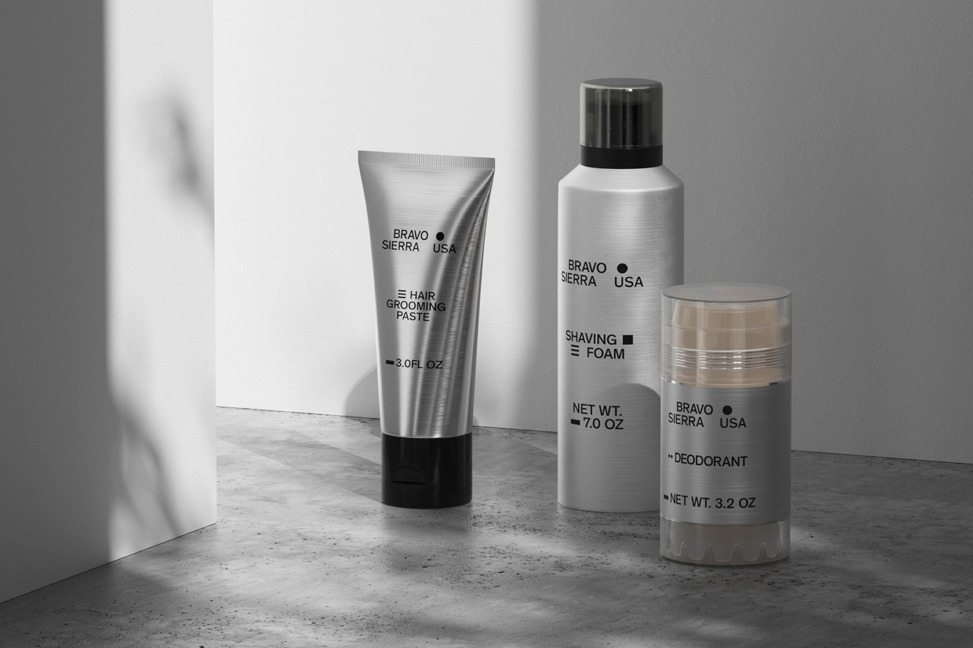
DoThings’ military-inspired packaging system for Bravo Sierra packs a minimalist punch
Military tested, high performance and sustainably produced – grooming brand Bravo Sierra doesn’t mess around. In order to achieve an identity that reflects the same cultivated strength and precision of their products, they called on Dothings for a comprehensive and awakening brand, concluding in a typographically astute and eye-catching visual identity. The NYC-based branding agency have prospered in simplicity and understatement; finding strength and cohesion in their rigid and minimalist graphic system. Typographically operating at one size, one weight and one colour, the type choice was vital to the success of the identity. Carried across from Bravo Sierra’s logo and basic brand guidelines created by Li, Inc, DoThings opted for the indisputable Theinhardt Medium as their champion typeface. “We kept this grotesque font for the brand due to its sleek, minimalistic beauty that highlights Bravo Sierra’s commitment to quality, precision and high performance,” DoThings explains, delighting in the minimalist distinction the typeface is imbued with. “We also chose to limit ourselves to one font and weight,” they add, “to focus on the efficiency of the products and convey the ‘no BS’ attitude of the brand.”


More Featured Inspiration

Students From Media Design School Redesign Kupu to Drive Everyday Use of Te Reo Māori by Eilish Neal , Scarlett Kang , Jayme Ducommun , Mehmet Gultekin , Jules Castillon

How Studio Dial turns tactile generative experiments into brand tools by Studio Dial

Fello by Bold Scandinavia

Ascent by Visual Journal Selection

Butterfly Cannon Blends the Worlds of Fine Wine & Whisky, With Their Creation of Glenmorangie’s Wine Cask Collection by Butterfly Cannon

Saxon Campbell on why side projects let designers be beginners again by Independent Studio
Looking to build an iconic brand identity or packaging?
US BRANDING STUDIO collaborates with ambitious founders, startups, and luxury brands to design distinctive visual identities, bespoke typography, packaging systems, and comprehensive design languages.