
From a Super Bowl ad to a rebrand: The Collected Works on the evolution of Expensify’s new look
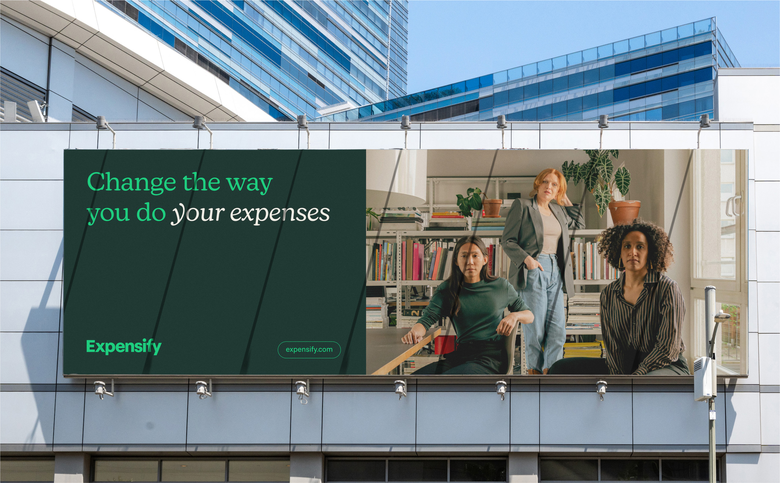
With the help of The Collected Works, Expensify has succeeded in building a brand world that makes the tedium of expense management into something truly weirdly wonderful and joyous. The financial management super app themselves describe it as “a colourful and surreal universe, where scanning receipts is as fun as popping a bottle of champagne.” Aiming to separate themselves from traditional financial softwares, Expensify collaborated with the New York City and New Orleans-based design studio on the brand overhaul, resulting in a robust identity system featuring a new logo, an expanded colour palette, typography, layouts, app and website refreshes, physical space build-outs, and motion graphics. We spoke to The Collected Works Co-founders Justin Colt and Jose Fresneda to delve deeper into the project and learn more about the process involved. What really sets Expensify apart is the vibrant and expressive world brimming with illustrations and motion. Following the success of Expensify’s 2019 Super Bowl commercial – featuring a brief animated interlude created by Augenblick Studios – an illustrated universe was irresistible to return to. The team at Expensify reached out once again to Augenblick Studios, who were just as keen to grow the small cast of characters they’d developed, alongside new environments, animations, and iconography. “What we wanted from them was to expand on the universe created for the Super Bowl spot,” Fresneda explains. “The only big stylistic change for them was to make sure that they only used the expanded colour palette that we had developed. That way all of the brand elements would be consistent with one another.” Expensify’s brand and marketing teams had identified an opportunity to bridge the gap that existed between the big personality of their advertising and marketing efforts, and the pared-down aspects of their brand. “This was actually one of the most exciting aspects when we first saw their initial brief,” Fresneda reveals. “We saw the potential of using these illustrations as a way to make the brand feel unique and different from any other brand in the expense management world. We explored a lot of different approaches – both stylistic and conceptual – as to how the illustrations should be used. Some approaches used them only as outlines to call less attention to them. Others collaged them on top of photography as if they were stickers.” From pared-back minimalism to a bombastic maximalist approach, the studio grew to better understand the pivotal role that illustration could play within the system.



More Featured Inspiration

Students From Media Design School Redesign Kupu to Drive Everyday Use of Te Reo Māori by Eilish Neal , Scarlett Kang , Jayme Ducommun , Mehmet Gultekin , Jules Castillon

How Studio Dial turns tactile generative experiments into brand tools by Studio Dial

Fello by Bold Scandinavia

Ascent by Visual Journal Selection

Butterfly Cannon Blends the Worlds of Fine Wine & Whisky, With Their Creation of Glenmorangie’s Wine Cask Collection by Butterfly Cannon

Saxon Campbell on why side projects let designers be beginners again by Independent Studio
Looking to build an iconic brand identity or packaging?
US BRANDING STUDIO collaborates with ambitious founders, startups, and luxury brands to design distinctive visual identities, bespoke typography, packaging systems, and comprehensive design languages.