
GrandArmy reflect Analog:Shift’s horological passion in the watch seller’s multi-faceted identity
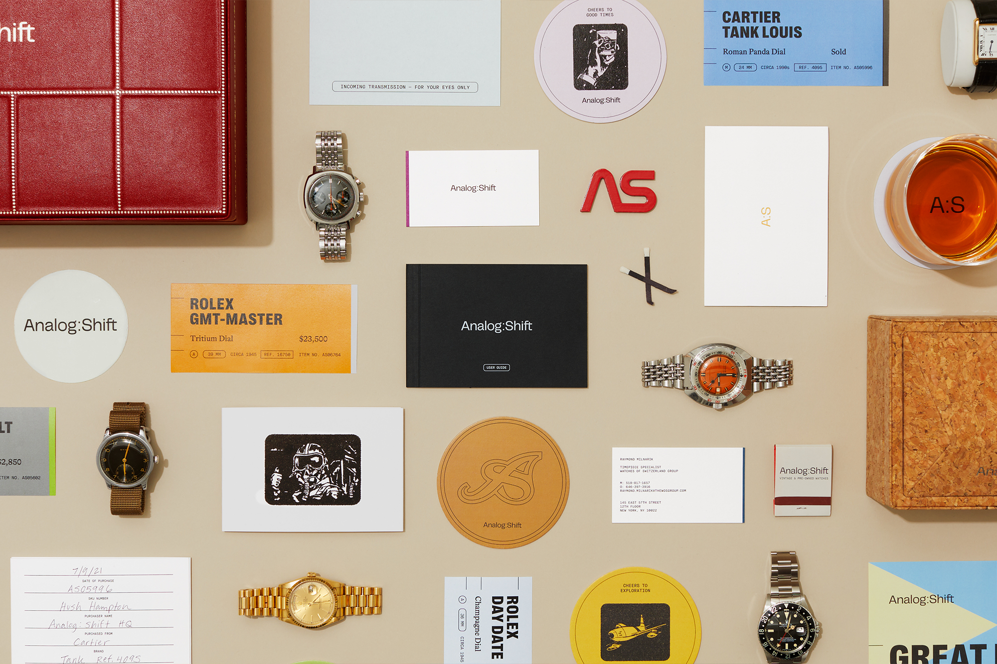
NYC-based creative agency GrandArmy have worked closely with vintage watch seller Analog:Shift, defining everything from its visual identity, copywriting, illustration and strategy to packaging design, positioning and event planning. Enlivening its visual language and tone of voice to reflect the eclecticism of its horological offering. With such a rich legacy of timekeeping pieces available on Analog:Shift’s roster, alongside the subsequent cult following of watch obsessives and aficionados, it was the role of GrandArmy to effectively translate their enthusiasm, variety and emotion across the visual language – shaping Analog:Shift to be as much an experience as a brand. The identity takes a systematic approach to capturing Analog:Shift’s multi-faceted audience and goods; beginning with a charming trio of typefaces. Right Grotesk by Pangram Pangram Foundry takes centre stage as the primary typeface, with support from Lineto’s Bradford and Milieu Grotesque’s Maison Neue. “Each font in our typeface system has unique merit for its role, but they also all enhance each other when combined,” Creative Director Joe Haddad tells us, backing the prolific family of Right Grotesk alongside Bradford’s nostalgic, storytelling tone and Maison Neue Mono’s mechanical aesthetic. GrandArmy opted to use an altered cut of Right Grotesk for the brand’s wordmark, modifying its letterforms to translate the detailing of watch faces and mechanisms conceptually. “It was important that the wordmark has a relationship with the typeface system it will so often be seen with,” Haddad recalls, “but also contain enough unique details to tell a story about the brand when seen alone,” using this notion to embellish the typeface with more pronounced geometric detailing and vertices. The bringing together of many, somewhat minor, changes, such as the flattened cap of the ‘A,’ sharpened ‘g’ and tailed ‘t,’ result in a timeless, considerate wordmark – one that sits effortlessly next to older and newer timepieces. “The wider cap ‘A’ balances better against the wide ‘S’ when the mark reduces to an ‘A:S’ monogram,” he adds, referring to the additional use of modified lettering within the brand’s bespoke suite of supporting graphic lockups.


More Featured Inspiration

Students From Media Design School Redesign Kupu to Drive Everyday Use of Te Reo Māori by Eilish Neal , Scarlett Kang , Jayme Ducommun , Mehmet Gultekin , Jules Castillon

How Studio Dial turns tactile generative experiments into brand tools by Studio Dial

Fello by Bold Scandinavia

Ascent by Visual Journal Selection

Butterfly Cannon Blends the Worlds of Fine Wine & Whisky, With Their Creation of Glenmorangie’s Wine Cask Collection by Butterfly Cannon

Saxon Campbell on why side projects let designers be beginners again by Independent Studio
Looking to build an iconic brand identity or packaging?
US BRANDING STUDIO collaborates with ambitious founders, startups, and luxury brands to design distinctive visual identities, bespoke typography, packaging systems, and comprehensive design languages.