
Marx Design’s identity for Yes You Can’s alcohol-free drinks unites their product and logo as one
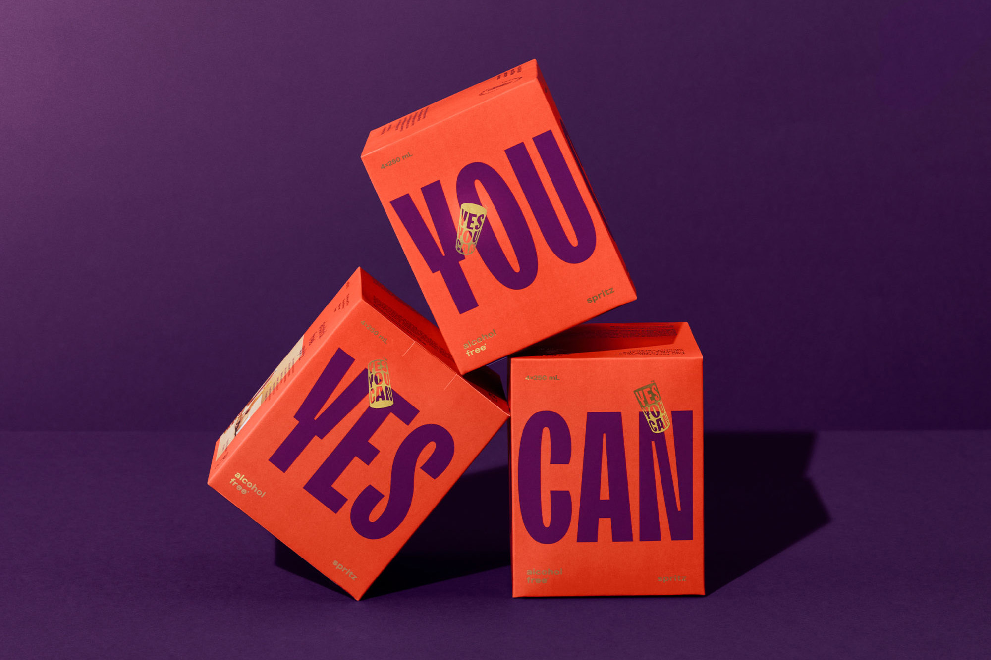
From the mind of former Olympic athlete Tyler Martin, Yes You Can have sought to disrupt Australia’s drinking culture; producing ready-made alcohol-free canned cocktails with the aim of countering the social stigma around lower ABV beverages. To achieve their aim, Martin turned towards a new audience, looking to capture the interest and inclusivity of a younger generation that are more open to questioning established social patterns. With this in mind, he commissioned Auckland-based creative agency Marx Design to develop the brand’s messaging and visual identity to best appeal to their target audience, as well as help achieve their aim of challenging established drinking conventions. Inspired by the brand’s name as a statement of the product’s intent, Marx Design let this notion bleed through into their design concept, whereby the product and the logomark are united as one. Taking a variable 3D form, the mark is capable of rotating and shifting depending on the orientation and context of its placement, resulting in a semi-skeuomorphic aesthetic bolstered by the impactful use of TypeType’s TT Trailers for the wordmark. “It offers the right balance of playfulness and sturdiness, and has enough nuance to be ownable,” Creative Director Tristan O’Shannessy tells us, discussing the thinking behind their typographic choices. “Lars by Bold Decisions was used for every other touchpoint in the brand for its youthful edge,” he adds, “it’s an incredibly well made typeface and a pleasure to use.” Alongside the identity’s typographic punch is a harmony between vibrant colour, contrast and illustration; both bolstering and balancing Yes You Can’s tone of voice and messaging. “We first developed a simple geometric illustration style, specifically to quickly convey key messages visually,” O’Shannessy recalls, used primarily in social media and marketing assets. “This geometric simplicity was then used as an ownable image framing device for social,” he adds, providing an ease of use and consistency for the brand as they grow. “The shape used most commonly is derived from three cans stacked side by side,” O’Shannessy concludes, “a nod to the three flavours they’ve launched with.”


More Featured Inspiration

Students From Media Design School Redesign Kupu to Drive Everyday Use of Te Reo Māori by Eilish Neal , Scarlett Kang , Jayme Ducommun , Mehmet Gultekin , Jules Castillon

How Studio Dial turns tactile generative experiments into brand tools by Studio Dial

Fello by Bold Scandinavia

Ascent by Visual Journal Selection

Butterfly Cannon Blends the Worlds of Fine Wine & Whisky, With Their Creation of Glenmorangie’s Wine Cask Collection by Butterfly Cannon

Saxon Campbell on why side projects let designers be beginners again by Independent Studio
Looking to build an iconic brand identity or packaging?
US BRANDING STUDIO collaborates with ambitious founders, startups, and luxury brands to design distinctive visual identities, bespoke typography, packaging systems, and comprehensive design languages.