
Moscow Mule’s vibrant identity for skincare brand Superbanka is fuelled by the energy of sport
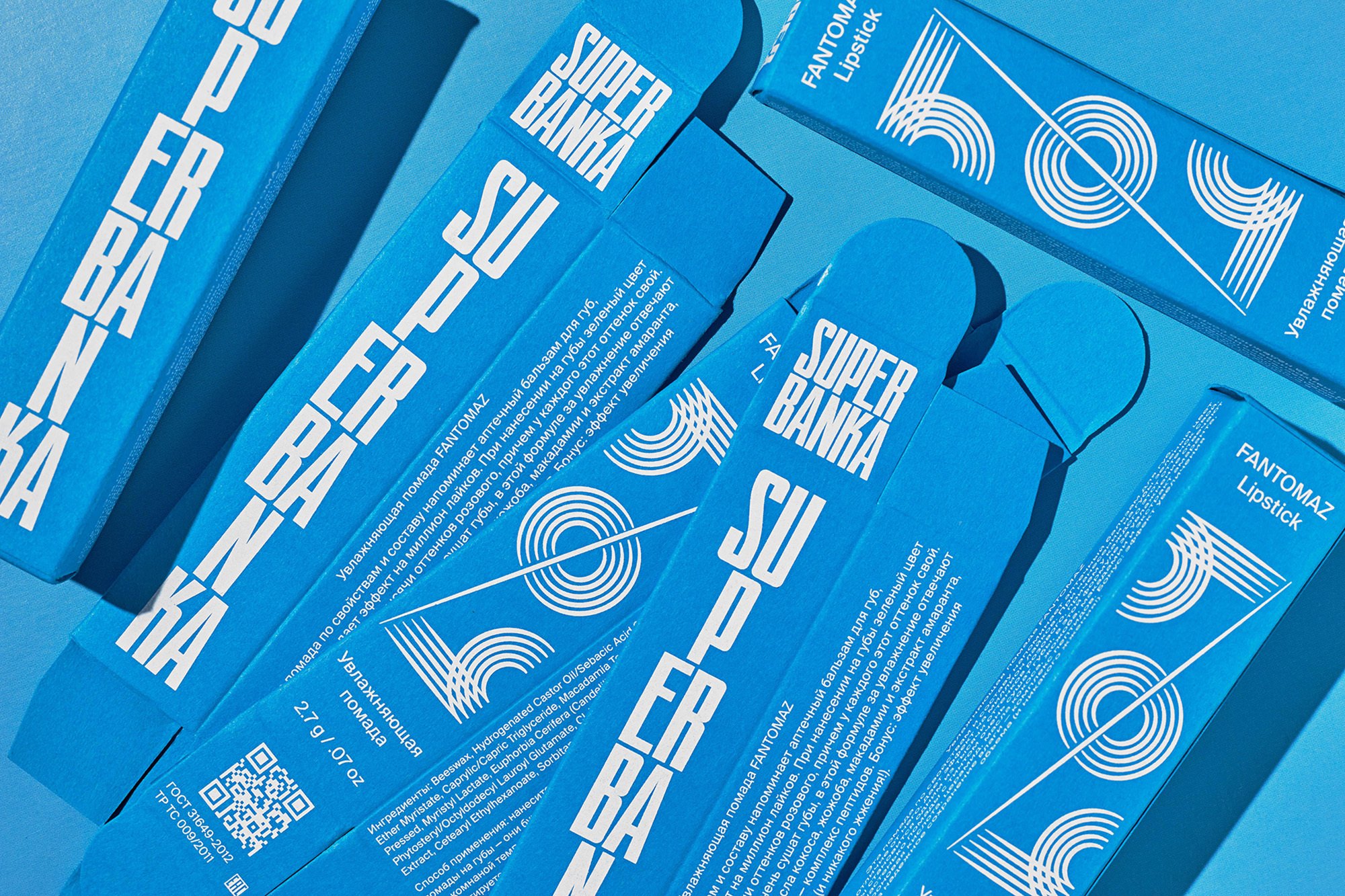
Catering to those with an active lifestyle and a customised skincare routine, Superbanka was created by Russian sports journalist and beauty enthusiast Maria Komandnaya, alongside cosmetic chemist Ekaterina Karpova. They approached international creative duo Moscow Mule to design the brand’s identity and packaging design that could convey their mission: to inspire and energise active individuals. As such, the pair developed a sporty look that draws on the aesthetic of sportswear brands whilst also nodding to Komandnaya’s background in sports journalism. The visual language is bright and impactful, thanks to a bold typographic direction that dominates the packaging layouts. “The typeface used for the logomark is WT Skrappa by Wise Type,” Moscow Mule Co-founder Marina Kondratenko tells us. “We were seeking a bold and direct typeface that conveys the brand’s powerful energy. The concept behind Superbanka was to create cosmetics for ‘superheroes’ who face multiple challenges daily, leading active lives, while maintaining their motivation. We believe that this typeface perfectly reflects the power of self-confidence.” To reinforce the brand’s dynamism, they played with the logo’s composition in various horizontal and vertical layouts. “The supporting typeface is our beloved workhorse Suisse Int’l by Swiss Typefaces,” Anna Kabanina continues. “To balance WT Skrappa, we chose to go with a more ‘quiet,’ neutral typeface that was going to be primarily used for text and technical specifications.” A selection of linear illustrations compliment the brand’s typography, referencing athletic facilities such as running tracks, basketball courts, and the lane lines of swimming pools. “Initially, we created three illustrations for each product with slight variations,” the pair note, “keeping in mind that once the product line starts to expand, the client will need to brand new products.” Now, the sports theme has expanded to include a wider range of references, beyond modern sports facilities. “For example,” they tell us, “we have created illustrations inspired by the old Soviet inventory ornaments, broadening our inspiration sources.”


More Featured Inspiration

Students From Media Design School Redesign Kupu to Drive Everyday Use of Te Reo Māori by Eilish Neal , Scarlett Kang , Jayme Ducommun , Mehmet Gultekin , Jules Castillon

How Studio Dial turns tactile generative experiments into brand tools by Studio Dial

Fello by Bold Scandinavia

Ascent by Visual Journal Selection

Butterfly Cannon Blends the Worlds of Fine Wine & Whisky, With Their Creation of Glenmorangie’s Wine Cask Collection by Butterfly Cannon

Saxon Campbell on why side projects let designers be beginners again by Independent Studio
Looking to build an iconic brand identity or packaging?
US BRANDING STUDIO collaborates with ambitious founders, startups, and luxury brands to design distinctive visual identities, bespoke typography, packaging systems, and comprehensive design languages.