
Mubien’s identity for Apostle champions graphic confidence and typographic simplicity
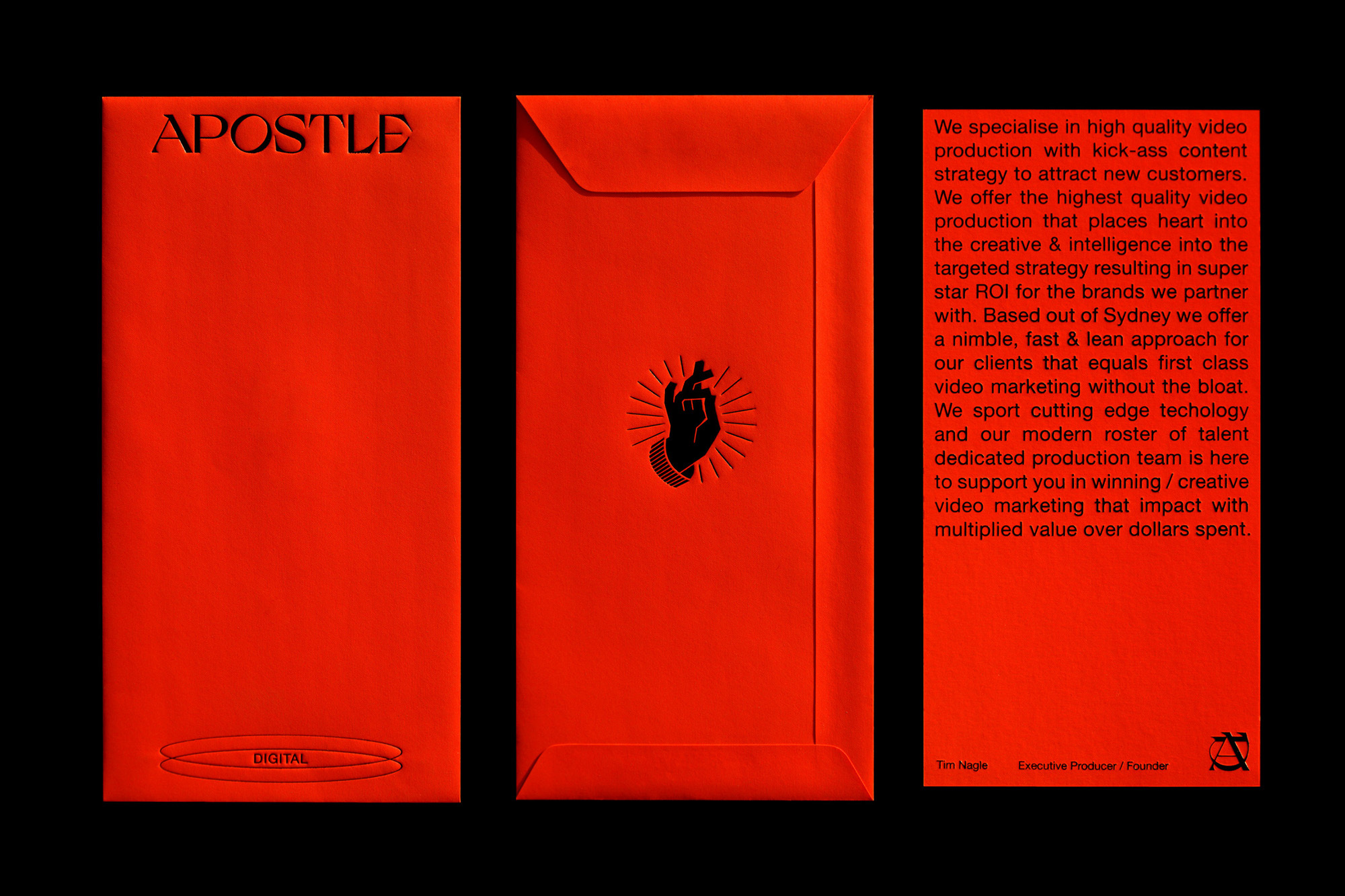
In a global endeavour, video marketing agency Apostle Digital, based in Sydney, approached Santander and California-based design agency Mubien for an entire brand overhaul of their ‘kick-ass video centred’ business. Beginning with the logomark, Mubien tells us “we choose and customised Grand Slang due to its uniqueness and aesthetic style,” something perfectly suited to the “modern and powerful personality of Apostle’s team and its naming.” Finding a contradictory complementation with the juxtaposing san serif, Grand Slang was partnered with Helvetica Neue, “creating high contrast and balance, providing cleanliness and legibility, enhancing the logo and the rest of the identity without stealing its prominence,” they explain. The core of the visual identity is undeniably its confident and unavoidable use of red, inspired by a fierce colour found in their archives. “One of the peculiarities of our studio is that our HQ is established on an old printing workshop inherited from our past generations,” Mubien tells us, “with century-old machines, full of paper catalogues that we use as part of our process.”


More Featured Inspiration

Students From Media Design School Redesign Kupu to Drive Everyday Use of Te Reo Māori by Eilish Neal , Scarlett Kang , Jayme Ducommun , Mehmet Gultekin , Jules Castillon

How Studio Dial turns tactile generative experiments into brand tools by Studio Dial

Fello by Bold Scandinavia

Ascent by Visual Journal Selection

Butterfly Cannon Blends the Worlds of Fine Wine & Whisky, With Their Creation of Glenmorangie’s Wine Cask Collection by Butterfly Cannon

Saxon Campbell on why side projects let designers be beginners again by Independent Studio
Looking to build an iconic brand identity or packaging?
US BRANDING STUDIO collaborates with ambitious founders, startups, and luxury brands to design distinctive visual identities, bespoke typography, packaging systems, and comprehensive design languages.