
Ollie&Co vibrantly capture the absurd visuals of bowling alleys in StrikeNet’s striking identity
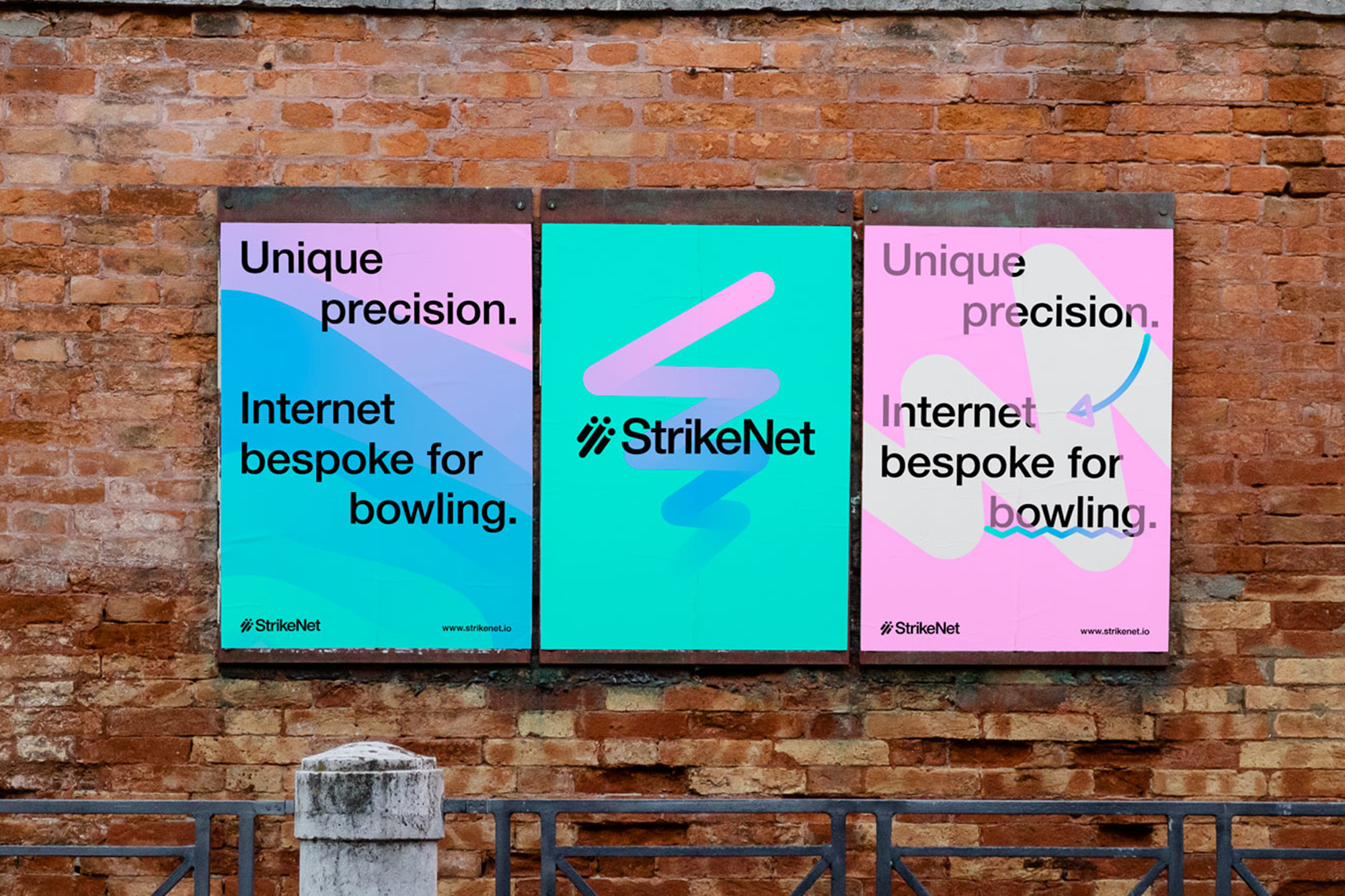
Marking an unconventional first, StrikeNet is an internet brand explicitly designed for bowling; working directly with the International Bowling Federation to produce accessible, secure and wide-reaching online services for the bowling community. Turning to Ollie&Co, the London and Sydney-based creative agency have developed a punchy and playful identity for the company under the notion of ‘Unique Precision,’ spanning physical merchandise and printed ephemera to their website, applications and digital tools. Merging the stark aesthetics of the technology industry and the absurd visuals of bowling alleys, Creative Director Ollie Booth tells us of the prominent use of vibrant hues and gradients throughout the brand. “The colour palette is inspired heavily by the gaudy hues found in bowling centre’s old and new,” Booth explains, recalling their bright flashing neon and over-the-top graphics. “We wanted the colour palette to be loud and ostentatious,” he continues, “allowing the supporting assets to be more refined,” such as the practical use of Helvetica Neue as the hero typeface. “When working through the brand pillars, we identified ‘precision’ and ’trustworthy’ as key targets,” he describes, “Helvetica Neue felt like the perfect partner to achieve that,” recalling the timeless aesthetic of the sans serif. Standing out from the crowd is StrikeNet’s energetic wordmark, which Booth notes as a legacy element from the previous identity due to its incorporation in existing physical applications. “Naturally, we ignored this request and adapted the logo to something that felt more in line with the branding,” Booth explains. “These days I think the logo is far less important than it used to be,” he adds, “that being said, leaving the logo as is would create a disconnect between the branding work we were doing.” Following discussions with the client, Booth explains that “we retained the icon as we felt the bowling ball shapes and shadows felt positive and ambitious heading in that upwards trajectory,” opting simply to clean up the logo geometrically and change the typeface to match the identity’s updated look. “We also capitalised the letter ‘N,’” he concludes, “to break up the word, helping with faster legibility and correct pronunciation.”


More Featured Inspiration

Students From Media Design School Redesign Kupu to Drive Everyday Use of Te Reo Māori by Eilish Neal , Scarlett Kang , Jayme Ducommun , Mehmet Gultekin , Jules Castillon

How Studio Dial turns tactile generative experiments into brand tools by Studio Dial

Fello by Bold Scandinavia

Ascent by Visual Journal Selection

Butterfly Cannon Blends the Worlds of Fine Wine & Whisky, With Their Creation of Glenmorangie’s Wine Cask Collection by Butterfly Cannon

Saxon Campbell on why side projects let designers be beginners again by Independent Studio
Looking to build an iconic brand identity or packaging?
US BRANDING STUDIO collaborates with ambitious founders, startups, and luxury brands to design distinctive visual identities, bespoke typography, packaging systems, and comprehensive design languages.