
Pendo provide a rich, soothing and wellness-based identity for New Zealand’s Manukora honey brand
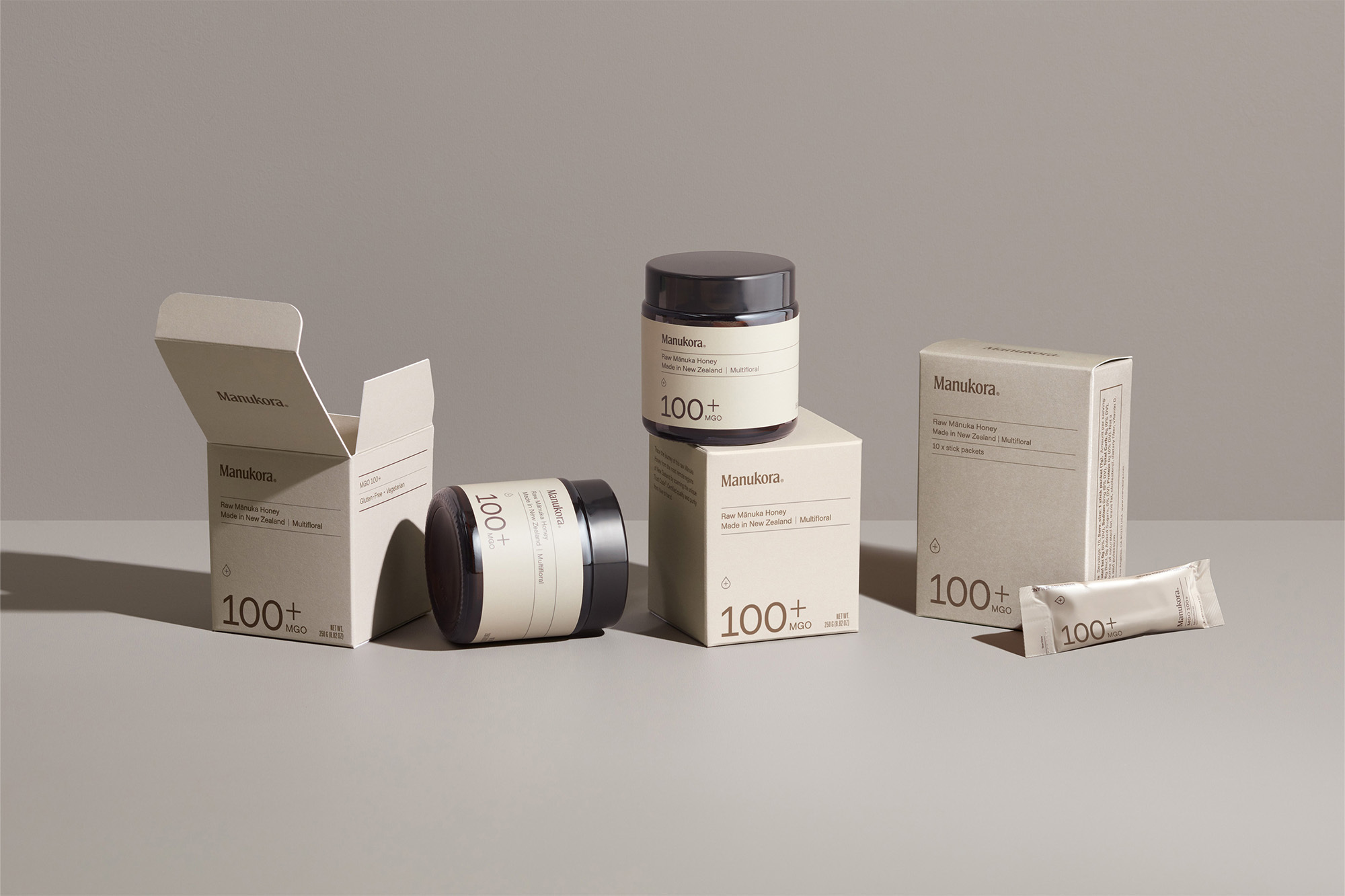
In the oversaturated wellness market, Manukora is a brand that taps into the natural resources offered by mother earth. In particular, the liquid gold of Manuka honey. Based in a small town at the foot of the Kaimai Range, they source Manuka honey from some of New Zealand’s most remote regions. At the heart of their 20-year long mission is wellness and sustainability, seen through a longstanding commitment to natural ingredients and ethical production. Manukora invited creative agency Pendo to create an identity that would reposition them with health and wellness at their core, resulting in an ‘upscale apothecary brand’ that is stripped down to the essentials. The Vancouver-based agency opted for a visual language that draws inspiration from both the brand’s history as well as the natural, medicinal properties and benefits of Manuka. A pairing of Northern Block’s serif Moret and Samuel Oakes’ Metro Sans provides a careful typographic balance for the brand’s messaging. “The combination speaks to both the history and locale of Manukora, and the simplicity and transparency of the product,” Creative Director and Co-founder Peter Ladd tells us. “This combo allows for a playful approach to communications, pairing the typefaces with specific messaging, and matching the feelings we wanted to evoke.”




More Featured Inspiration

Students From Media Design School Redesign Kupu to Drive Everyday Use of Te Reo Māori by Eilish Neal , Scarlett Kang , Jayme Ducommun , Mehmet Gultekin , Jules Castillon

How Studio Dial turns tactile generative experiments into brand tools by Studio Dial

Fello by Bold Scandinavia

Ascent by Visual Journal Selection

Butterfly Cannon Blends the Worlds of Fine Wine & Whisky, With Their Creation of Glenmorangie’s Wine Cask Collection by Butterfly Cannon

Saxon Campbell on why side projects let designers be beginners again by Independent Studio
Looking to build an iconic brand identity or packaging?
US BRANDING STUDIO collaborates with ambitious founders, startups, and luxury brands to design distinctive visual identities, bespoke typography, packaging systems, and comprehensive design languages.