
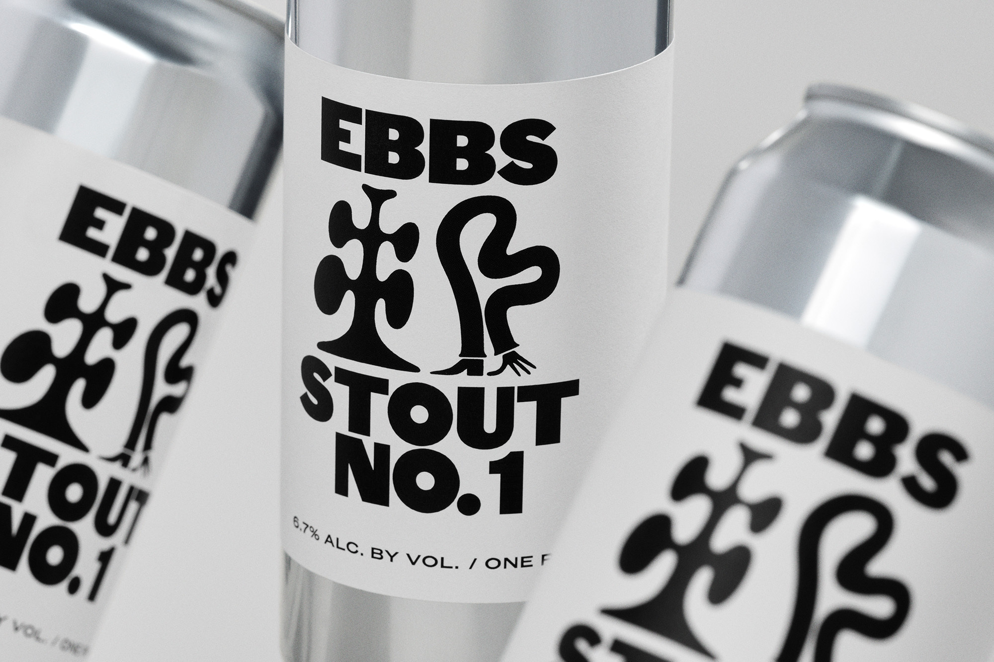
Pentagram’s identity for craft beer brewery EBBS takes characterful cues from the city of New York
In the face of convoluted, hectic and hackneyed craft beer brands, Williamsburg-based brewery EBBS stands against the tide; taking a pragmatic, uncomplicated and characterful approach to their identity – which was crafted with the help of Michael Bierut and his team at Pentagram in New York. The stark identity is a showcase of how fun a fundamentally structured graphic system can be; providing a rigid framework for the typography to truly thrive, with the team electing for Original Sans as their primary typeface. “There is a crude irreverence to Original Sans,” Pentagram’s Jonny Sikov tells us, “that feels appropriate in the context of a New York-based brewery despite being a typeface with British origins.” Rampant in good humour and familiarity, Original Sans provides the identity with a flamboyant yet practical heart, leaving the supporting Caslon Doric Collection to act in a more utilitarian capacity. “Optical styles, such as Caslon Doric Condensed Text, became particularly useful for things like government warning labels,” Sikov explains, “where text sizes get small and real-estate is limited.” Accompanying the type is the inclusion of equivalently stark and charming monochromatic illustrations from a dream team of collaborators, including Chris DeLorenzo, Lennard Kok, Pol Monserrat and Andreas Samuelsson. “The brief given to the illustrators was intentionally very open-ended,” Sikov explains, “there was a desire to treat the label as a sort of blank canvas, free for interpretation by different illustrators and artists,” prompting them to respond to the city around them. Given only the rule of working in black and white, Sikov adds “anything was fair game.”


More Featured Inspiration

Students From Media Design School Redesign Kupu to Drive Everyday Use of Te Reo Māori by Eilish Neal , Scarlett Kang , Jayme Ducommun , Mehmet Gultekin , Jules Castillon

How Studio Dial turns tactile generative experiments into brand tools by Studio Dial

Fello by Bold Scandinavia

Ascent by Visual Journal Selection

Butterfly Cannon Blends the Worlds of Fine Wine & Whisky, With Their Creation of Glenmorangie’s Wine Cask Collection by Butterfly Cannon

Saxon Campbell on why side projects let designers be beginners again by Independent Studio
Looking to build an iconic brand identity or packaging?
US BRANDING STUDIO collaborates with ambitious founders, startups, and luxury brands to design distinctive visual identities, bespoke typography, packaging systems, and comprehensive design languages.