
Studio Oker’s inviting identity for UX design studio Okse is rooted in character and country
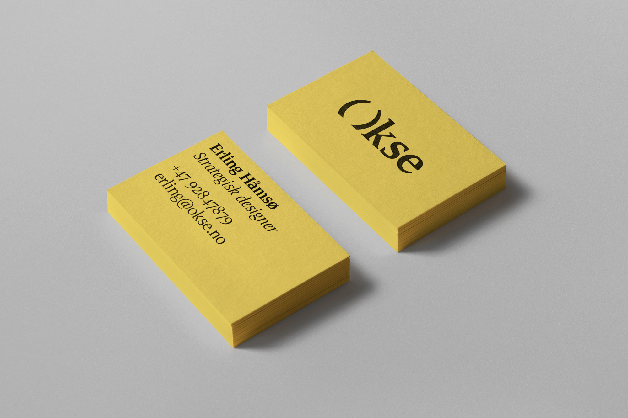
Found in Stavanger, Norway, independent multi-industrial UX design studio Okse keep the personable at the front of their practice – excelling at what they do and forming lasting working relationships along the way. In an effort to greater express the friendliness and personality of their studio, Okse called on similarly named, and similarly addressed, Stavanger-based design agency Studio Oker to refresh their identity. The result is a charming, illustrative and typographically focused brand that is far from prescripted; rooting itself conceptually within the land and the bull. The land in question is Jæren, “a large flat lowland area in Norway where Okse is located,” Baard Kolstad, Partner at Studio Oker explains, “it is one of the most important agricultural areas of Norway, known for its rough climate and its hard-working, straight forward and stubborn farmers.” With the adage of both the farmer and the ox having a good life due to the good soil, Okse aims to metaphorically distil this into the company; both internally and in the exterior brand. Starting with their namesake bull (which is ‘Okse’ in Norweigian), Studio Oker approached this by creating some literally, punctual horns constructed of parentheses – both signifying the bull as well as utilising the coding-based language of web development. The typeface chaperoning this symbol is Commercial Type’s Dignitas; a stark and sharp serif typeface, who’s acute construction is similarly indicative of horns, as well as providing a beautiful concoction of playful expression and scholarly refinement.


More Featured Inspiration

Students From Media Design School Redesign Kupu to Drive Everyday Use of Te Reo Māori by Eilish Neal , Scarlett Kang , Jayme Ducommun , Mehmet Gultekin , Jules Castillon

How Studio Dial turns tactile generative experiments into brand tools by Studio Dial

Fello by Bold Scandinavia

Ascent by Visual Journal Selection

Butterfly Cannon Blends the Worlds of Fine Wine & Whisky, With Their Creation of Glenmorangie’s Wine Cask Collection by Butterfly Cannon

Saxon Campbell on why side projects let designers be beginners again by Independent Studio
Looking to build an iconic brand identity or packaging?
US BRANDING STUDIO collaborates with ambitious founders, startups, and luxury brands to design distinctive visual identities, bespoke typography, packaging systems, and comprehensive design languages.