
Studio Oker’s slick and systematic identity for Norsk Etikett reflects their production process
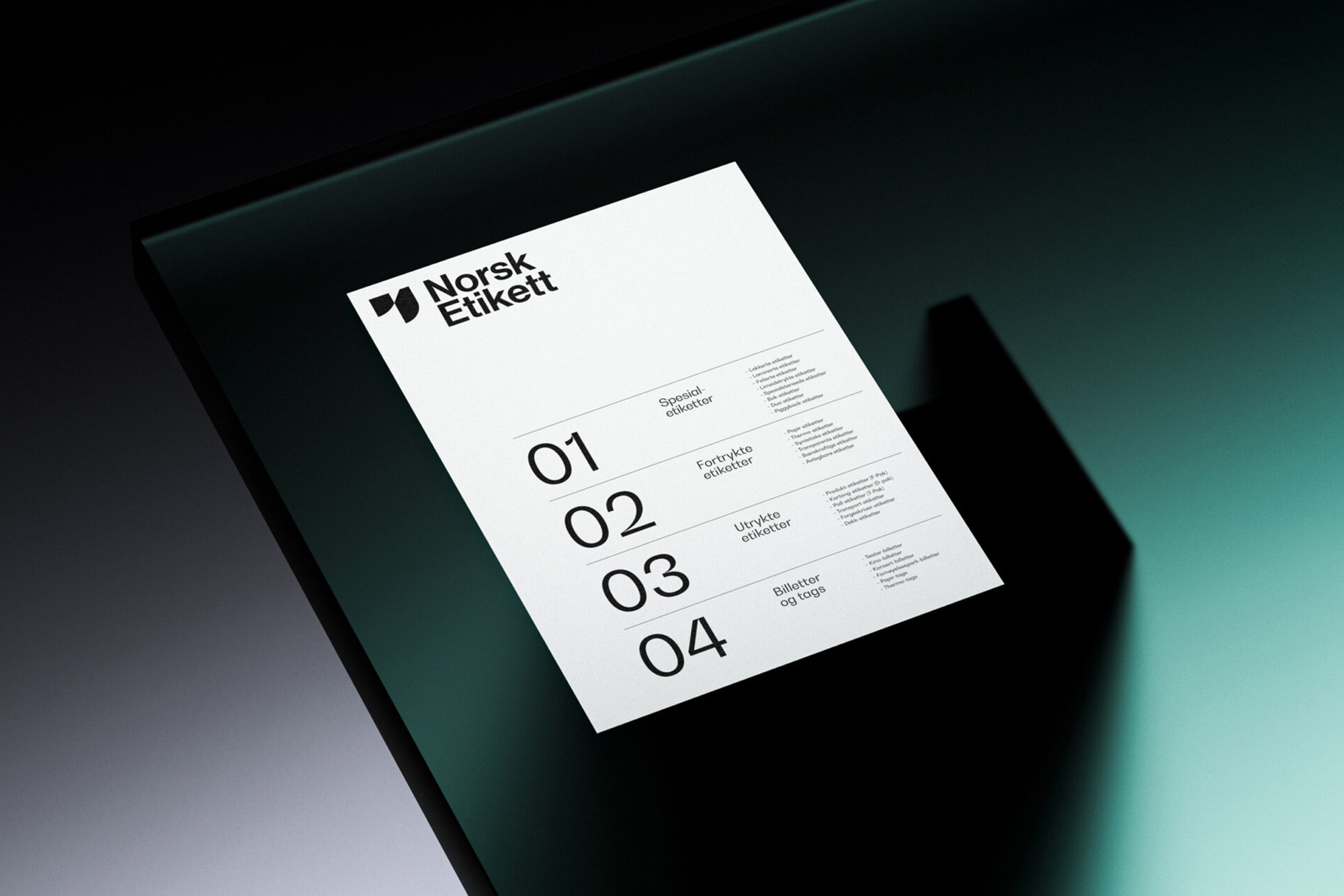
Stavanger-based design agency Studio Oker have collaborated with Norway’s premier printer Norsk Etikett, capitalising on their speciality in label printing to develop a brand identity and website representative of their expertise. Crafting a slick, utilitarian and systematic visual language flavoured with moments of punch and character. Studio Oker’s graphic solution conceptually and aesthetically embodies the appearance of labels – as well the process of printing, cutting and pasting. At the heart of this direction is the distinctive carved logomark; the contrasting forms of which visually signify the soft and solid materials within a printing studio. Brought alive digitally, the resulting icon captures the powerful balance of pragmatism and artistry present in the printing process. Where design and technical know-how work in harmony. Supporting the logomark is Studio Oker’s implementation of type, beginning with Neue Haas Grotesk for Norsk Etikett’s wordmark. “We felt that it added a timeless quality,” Partner & Designer Baard Kolstad tells us, “that paired nicely together with Bw Gradual for the rest of the communication,” he adds, referring to their introduction of Branding with Type’s sans serif as the identity’s leading typeface. “Bw Gradual was chosen because we felt that the letterforms related nicely to the shapes in the logo symbol,” Kolstad explains, with both sharing a corresponding contrast in forms, as well as, a graphic allusion to movement.


More Featured Inspiration

Students From Media Design School Redesign Kupu to Drive Everyday Use of Te Reo Māori by Eilish Neal , Scarlett Kang , Jayme Ducommun , Mehmet Gultekin , Jules Castillon

How Studio Dial turns tactile generative experiments into brand tools by Studio Dial

Fello by Bold Scandinavia

Ascent by Visual Journal Selection

Butterfly Cannon Blends the Worlds of Fine Wine & Whisky, With Their Creation of Glenmorangie’s Wine Cask Collection by Butterfly Cannon

Saxon Campbell on why side projects let designers be beginners again by Independent Studio
Looking to build an iconic brand identity or packaging?
US BRANDING STUDIO collaborates with ambitious founders, startups, and luxury brands to design distinctive visual identities, bespoke typography, packaging systems, and comprehensive design languages.