
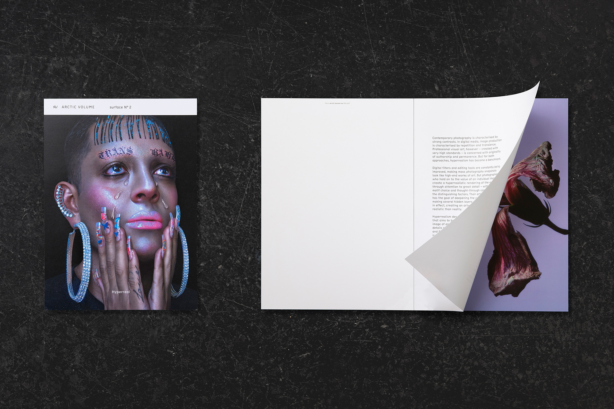
Surface N° 2 showcases Arctic Volume; a sustainably produced, matt-coated stock from Arctic Paper
As part of their ongoing work with Arctic Paper, Europe’s largest manufacturer of natural paper, Hamburg-based design studio JUNO have developed the identity and campaign for Arctic Volume; a matt-coated paper range available in Ice, Highwhite, White and Ivory. Above simply excelling at photographic reproduction, the Arctic Volume range is also sustainably produced – making its distinctive natural, tactile touch feel all the better. Leading the campaign is the second issue of Surface, a printed magazine that champions the identity and poetically showcases the paper itself. Surface N° 2 exhibits a curated selection of artists’ work, collated under the theme of hyperrealism. “Arctic Volume sees itself as a kind of symbiotic partner for creatives and artists who place particular emphasis on precision, detail and tactile character in their work,” JUNO tell us, discussing the connection between hyperrealism and Arctic Volume. “The visual and 3D artists represented in Surface N° 2 are interested in exploring a kind of exaggeration of reality through their art,” they add, much like the mid-century American hyperrealists that used this notion of precision as the distinguishing feature of their practice. “To be more realistic than reality means for them to make visible many hidden layers in the object of their curiosity,” JUNO explain, finding an appropriate vessel for this approach in the form of Arctic Volume. Highlighting the work of globally revered artists like Namsa Leuba and Cody Cobb, Surface paints a progressive perspective on the contemporary relevance of hyperrealism; asking us to expand our expectations of reality, imagination and technology. Given the context of today’s overtly immediate access to viewing imagery and taking our own, our perception of documented reality has drastically shifted, and it's the success of Surface’s featured artists that challenge this perspective. “We were interested in illuminating approaches to the overarching theme of hyperrealism from different directions,” JUNO recall, considering work from across photography, art, fashion and digital. “We also did not shy away from motifs that are difficult to print,” they add, such as intensely populated areas of grey within imagery, “however, by working with the print shop ‘Göteborgstryckeriet,’ we were able to push the envelope and explore this interface.”


More Featured Inspiration

Students From Media Design School Redesign Kupu to Drive Everyday Use of Te Reo Māori by Eilish Neal , Scarlett Kang , Jayme Ducommun , Mehmet Gultekin , Jules Castillon

How Studio Dial turns tactile generative experiments into brand tools by Studio Dial

Fello by Bold Scandinavia

Ascent by Visual Journal Selection

Butterfly Cannon Blends the Worlds of Fine Wine & Whisky, With Their Creation of Glenmorangie’s Wine Cask Collection by Butterfly Cannon

Saxon Campbell on why side projects let designers be beginners again by Independent Studio
Looking to build an iconic brand identity or packaging?
US BRANDING STUDIO collaborates with ambitious founders, startups, and luxury brands to design distinctive visual identities, bespoke typography, packaging systems, and comprehensive design languages.