
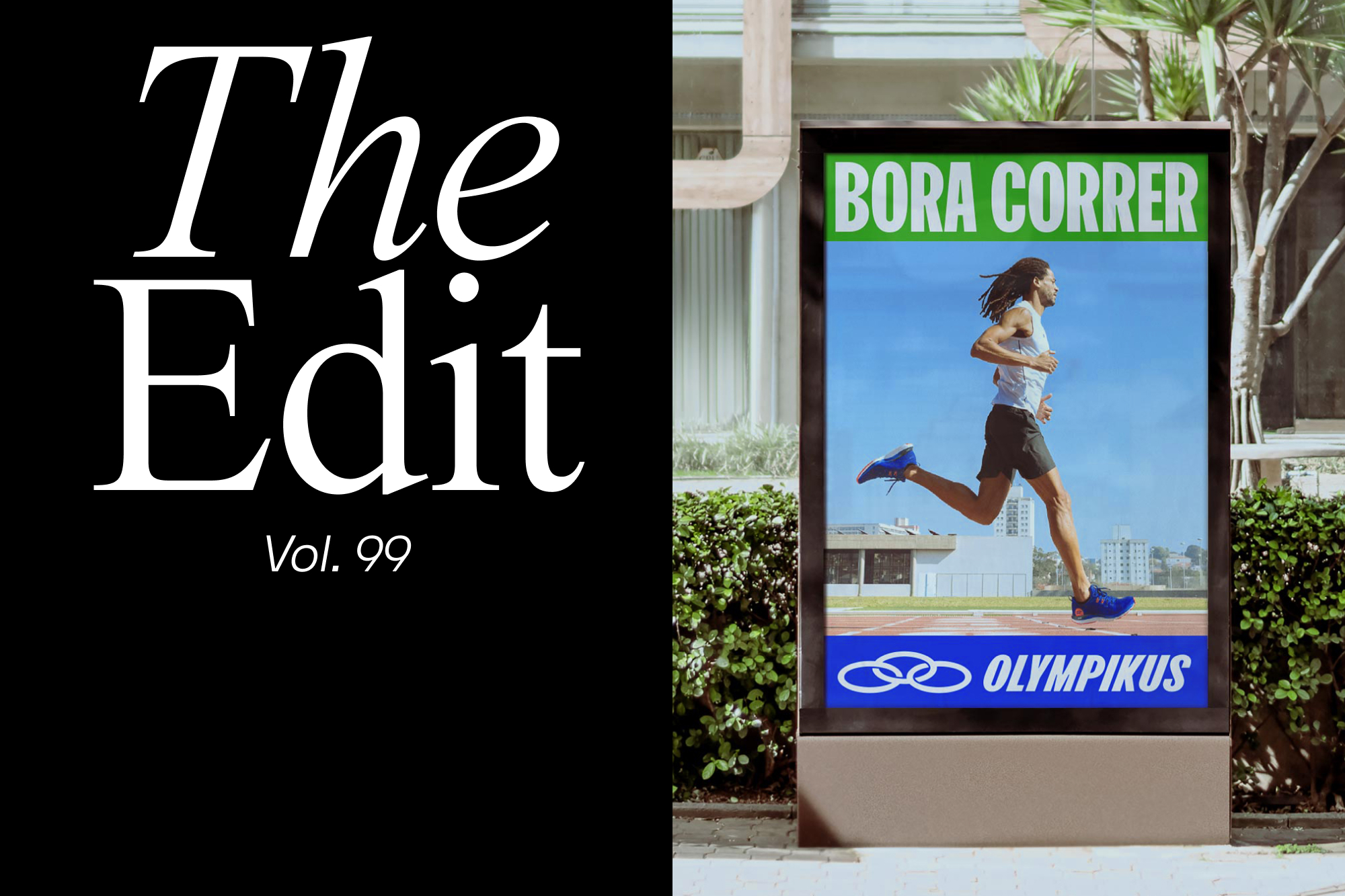
The Edit: five projects including PORTO ROCHA’s identity for Brazillian sports brand Olympikus
Each and every day, we're lucky to discover dozens of interesting and inspiring projects from around the world. From global identities and campaigns to side projects and independently published books, The Edit is home to five of them; every two weeks. Olympikus, the most prominent sports brand in Brazil, set its sights on expanding its products, reaching new audiences, and strengthening existing ones. The rebrand by New York-based design studio PORTO ROCHA was a surefire way of achieving those goals. The refreshed identity brings a more confident and assured look to the brand’s pre-existing elements, from the colour palette’s active hues to the dynamic italics of the typography, featuring Florian Karsten’s FK Olympikus. The punchy custom display typeface is paired with Signal by Production Type. The identity comes together through a robust and flexible modular system inspired by the stripes and geometry typically found in running tracks and sports flags. London-based design studio DutchScot worked closely with interior architects Conran and Partners, and public realm specialists MICA Architects, to authentically tell the story behind Centre Point, once a disused office block seen as a ‘blight on the horizon,’ that is now a set of apartments and a public square. The publication marks the first in a series launched by property developer Almacantar, which aims to celebrate the untold story of a property – with a focus on the challenges, design and architecture behind it. Ordered chronologically, the book takes the reader from the original vision in the 1960s, through to the construction process and finished project. Translucent pages are interspersed throughout, inspired by the architect’s use of tracing paper. These sheets, featuring original sketches by Conran and Partners and MICA, provide a juxtaposition with the photography, in both its before and after state as the loose gestural marks contrast with the sleek geometric forms of the buildings. The dust jacket continues this idea, with more sketches overlying the clean sans serif typography on the cover below.


More Featured Inspiration

Students From Media Design School Redesign Kupu to Drive Everyday Use of Te Reo Māori by Eilish Neal , Scarlett Kang , Jayme Ducommun , Mehmet Gultekin , Jules Castillon

How Studio Dial turns tactile generative experiments into brand tools by Studio Dial

Fello by Bold Scandinavia

Ascent by Visual Journal Selection

Butterfly Cannon Blends the Worlds of Fine Wine & Whisky, With Their Creation of Glenmorangie’s Wine Cask Collection by Butterfly Cannon

Saxon Campbell on why side projects let designers be beginners again by Independent Studio
Looking to build an iconic brand identity or packaging?
US BRANDING STUDIO collaborates with ambitious founders, startups, and luxury brands to design distinctive visual identities, bespoke typography, packaging systems, and comprehensive design languages.