
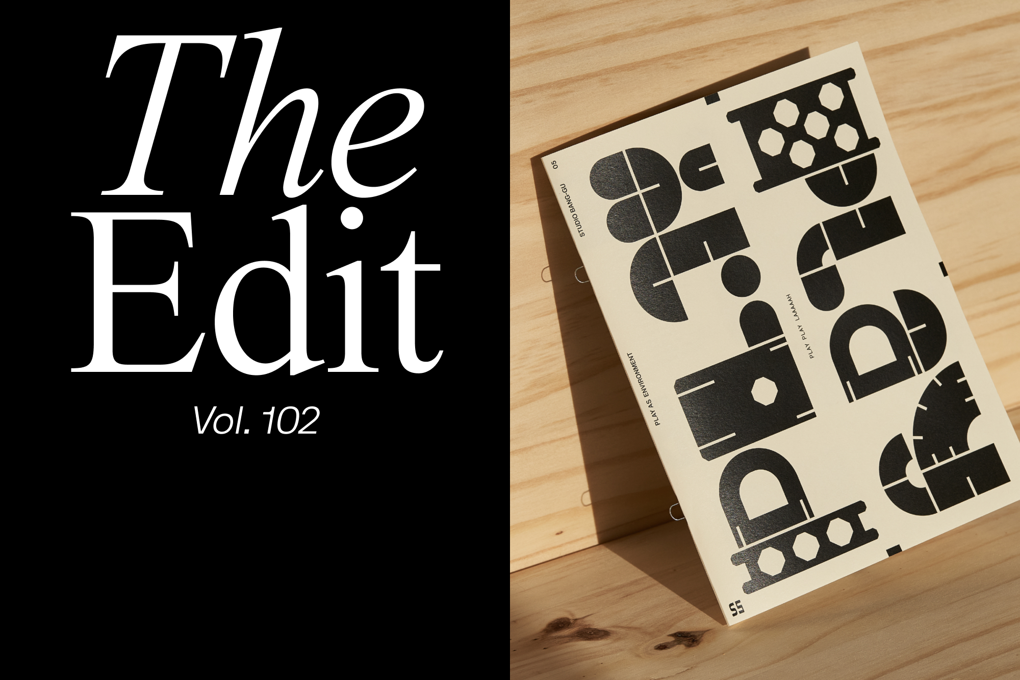
The Edit: five projects including Studio Bang-Gu modular type-driven magazine Play Play Laaaaah
Each and every day, we're lucky to discover dozens of interesting and inspiring projects from around the world. From global identities and campaigns to side projects and independently published books, The Edit is home to five of them; every two weeks. Studio Bang-Gu draw upon Singapore’s heritage and way of playing in their reimagining of Singapore’s dragon playground. The pages of the accompanying zine, Play Play Laaaaah, aim to evoke memories of childhood – a simpler time when decisions were made based on a game of hand gestures. Built in 1970, the dragon playground is one of the most famous playgrounds in Singapore – simple in function yet rich in imagination, the playground has provided a space for children to meet and play across cultures, races and religions. Honouring the nostalgia of youth and the history of Singapore, the zine is about reimagining Singapore’s most iconic playground for the next generation, inspiring future generations to be curious and imaginative while playing. The forms of the playground itself are reconstructed to form a modular display typeface, providing endless possibilities within the design output. Paired with the reimagined wooden dragon playground design, the zine offers a history of the playground, flashback moments of the games the designers used to play, and several examples of the exciting possibilities that can be created with the ‘playground’ toy. New York-based design agency High Tide have partnered with audio furniture brand Symbol to create an identity as timeless as its products. Challenging the current furniture market – full of disposable furniture design – Symbol is driven by a passion for design, music, beauty and function. The brand hopes to shift how we connect with the pieces in our homes, led by the belief that beautiful furniture holds lasting emotional value. With this in mind, the visual language by High Tide channels the vibrant nostalgia of notable design eras, from mid-century design to 70’s typography. Type and colour carry the warmth, boldness and personality of the brand, further embodied in the oversized mid-century-inspired wordmark.


More Featured Inspiration

Students From Media Design School Redesign Kupu to Drive Everyday Use of Te Reo Māori by Eilish Neal , Scarlett Kang , Jayme Ducommun , Mehmet Gultekin , Jules Castillon

How Studio Dial turns tactile generative experiments into brand tools by Studio Dial

Fello by Bold Scandinavia

Ascent by Visual Journal Selection

Butterfly Cannon Blends the Worlds of Fine Wine & Whisky, With Their Creation of Glenmorangie’s Wine Cask Collection by Butterfly Cannon

Saxon Campbell on why side projects let designers be beginners again by Independent Studio
Looking to build an iconic brand identity or packaging?
US BRANDING STUDIO collaborates with ambitious founders, startups, and luxury brands to design distinctive visual identities, bespoke typography, packaging systems, and comprehensive design languages.