
Type, Tracking & Terminals: 8 sans serifs with a twist including Dinamo and Displaay (Part One)
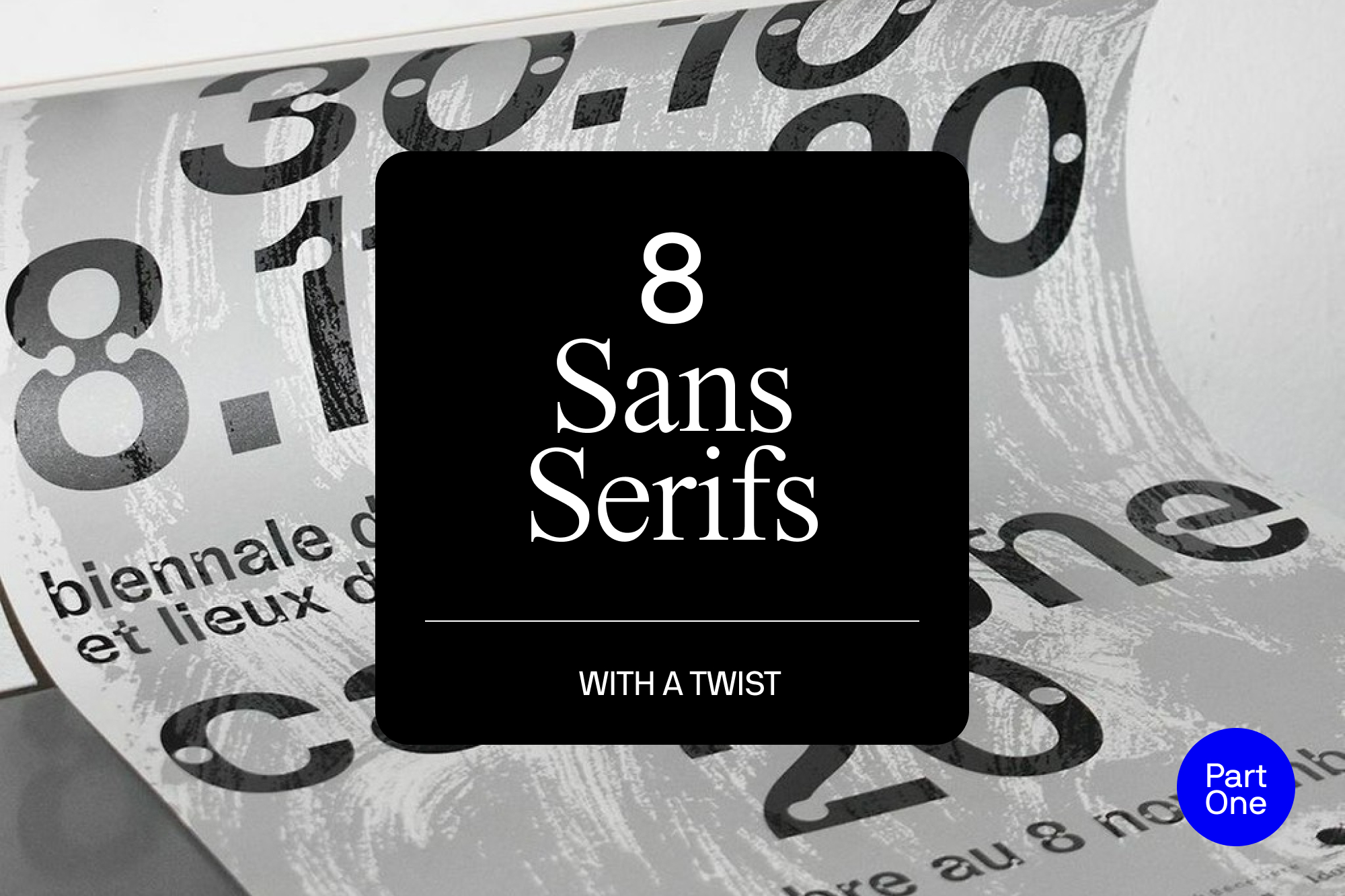
A topic with the power to spark heated debates and divide studios, type choices are a passionate territory for designers. Who doesn’t have a favourite typeface? Instead of compiling a list of Helvetica lookalikes, we wanted to share some unique and experimental sans serifs for you to try out in your next projects. From marker pens to light traps, these eight typefaces show that inspiration can be found in the unexpected. While many contemporary sans serif typefaces are known for an amenable, smooth roundness, La Rochelle-based foundry A is for have provided something a bit more textured with the angular curves of BPT. The design was heavily inspired by the typeface used in AutoCAD, a computer-assisted design software used by architects. The name, which stands for Building, Typing, Publishing, is also a nod to the software’s impact. Born out of a typographic experiment for Issue #195 of the French design magazine Étapes, entitled ‘Somewhere between graphic design and architecture…,’ the typeface was enhanced and developed by Jeremy Perrodeau and Guillaume Grall. BTP.


More Featured Inspiration

Students From Media Design School Redesign Kupu to Drive Everyday Use of Te Reo Māori by Eilish Neal , Scarlett Kang , Jayme Ducommun , Mehmet Gultekin , Jules Castillon

How Studio Dial turns tactile generative experiments into brand tools by Studio Dial

Fello by Bold Scandinavia

Ascent by Visual Journal Selection

Butterfly Cannon Blends the Worlds of Fine Wine & Whisky, With Their Creation of Glenmorangie’s Wine Cask Collection by Butterfly Cannon

Saxon Campbell on why side projects let designers be beginners again by Independent Studio
Looking to build an iconic brand identity or packaging?
US BRANDING STUDIO collaborates with ambitious founders, startups, and luxury brands to design distinctive visual identities, bespoke typography, packaging systems, and comprehensive design languages.