
Universal Favourite’s rebrand of Colour Mill captures the vibrant soul of the baking community
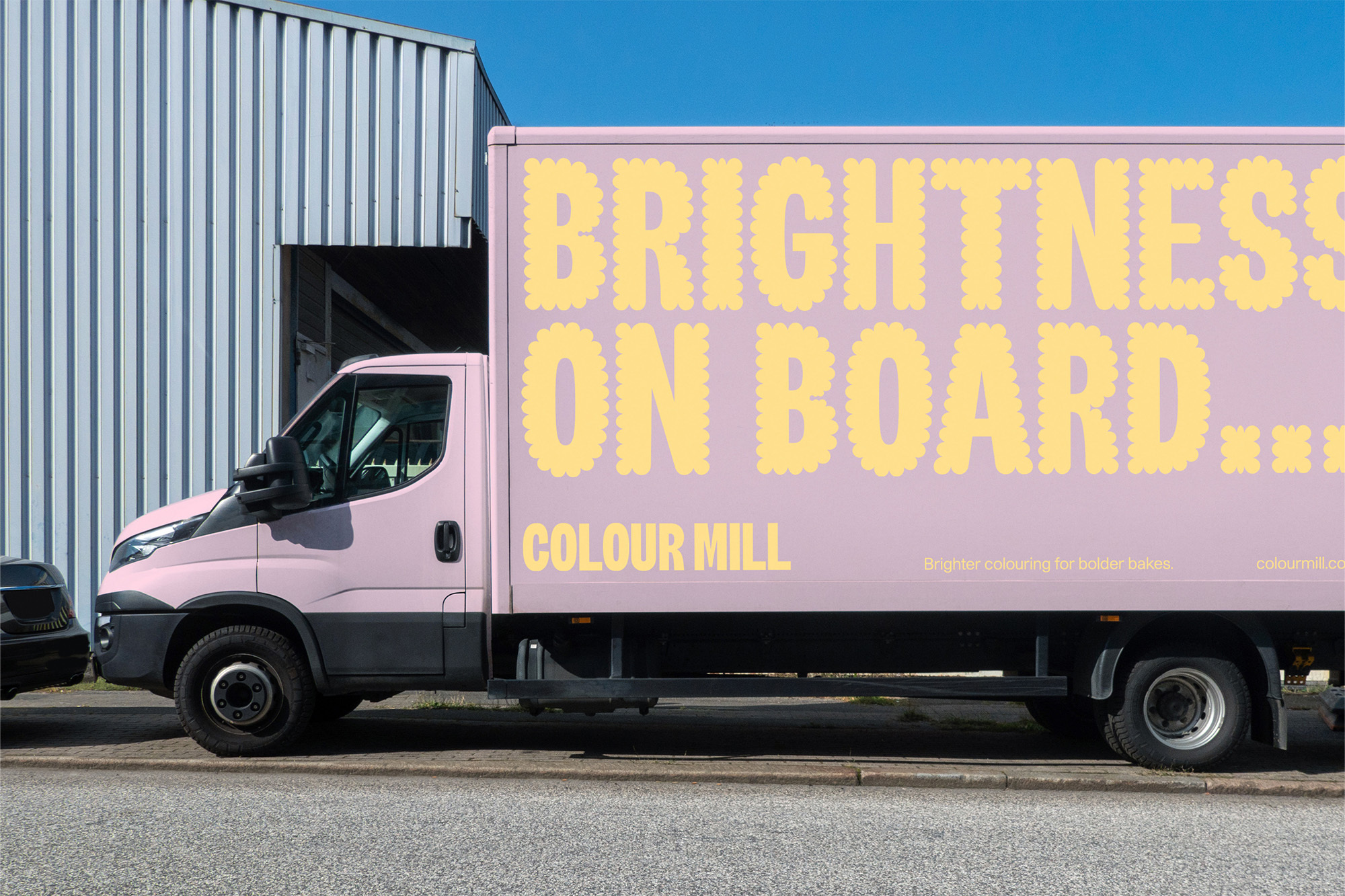
In a category filled with subpar products, Colour Mill has prided itself on its market-leading food colourings (pigments, not dyes!) for over 30 years. Despite a solid reputation, its branding never quite exuded the same impact as its products. Seeking a revamped identity to reflect the vibrance, quality and reputation of the products, the Australian company reached out to the team at Universal Favourite. The Sydney-based design studio then devised a visual language that captures the expressive, imaginative and creative nature of the cake-making and baking community. This started with the anchor of the identity – the logomark – which sparked a bespoke typeface. “The typeface was made from scratch,” Creative Director Ali Ozden tells us. “Originally intended for just the logo, the typeface was developed out to create an ownable asset for Colour Mill that would easily differentiate them from their competitors,” he adds. Universal Favourite also designed a ‘Colour Milled’ version of the custom typeface that draws inspiration from the textures of piped icing. “The milled cut of the ‘CM’ brand mark is the one that is used the most across their customer-facing applications,” Ozden says. “The unmilled ‘CM’ mark is used mostly for corporate communications or B2B applications where the brand needed to feel more serious.” Because of the solid and friendly personality of the custom typeface, Universal Favourite opted for Multi Form’s Studio Pro as the supporting typeface. As a neutral sans serif, it was the perfect accompaniment that works seamlessly across the website and social media platforms.


More Featured Inspiration

Students From Media Design School Redesign Kupu to Drive Everyday Use of Te Reo Māori by Eilish Neal , Scarlett Kang , Jayme Ducommun , Mehmet Gultekin , Jules Castillon

How Studio Dial turns tactile generative experiments into brand tools by Studio Dial

Fello by Bold Scandinavia

Ascent by Visual Journal Selection

Butterfly Cannon Blends the Worlds of Fine Wine & Whisky, With Their Creation of Glenmorangie’s Wine Cask Collection by Butterfly Cannon

Saxon Campbell on why side projects let designers be beginners again by Independent Studio
Looking to build an iconic brand identity or packaging?
US BRANDING STUDIO collaborates with ambitious founders, startups, and luxury brands to design distinctive visual identities, bespoke typography, packaging systems, and comprehensive design languages.