
WundermanThompson’s bespoke typeface celebrates the marriage of two historic agencies
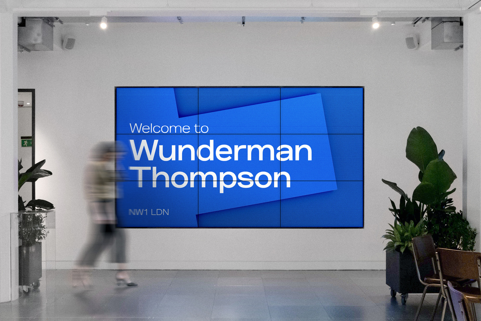
At the end of 2018, advertising giant WPP announced a merger between two of its companies, J. Walter Thompson and Wunderman. The result is WundermanThompson, a digital agency with more than 80 offices globally. Their London-based design team were given the task of branding the newly-formed agency and therefore, throughout 2019, decided to meticulously craft a bespoke typeface inspired by their rich history. Type designers Samuel Powell (Archive Foundry) and Samuel Oakes underwent an extensive research process, which ultimately led them to J. Walter Thompson and Wunderman’s foundation in early 20th century New York. The architecture and typographic styles from this period became hugely influential in the creation of the typeface, informing its overall personality as well as several stylistic intricacies. Powell and Oakes were particularly inspired by the semi-extended, hand-painted lettering found on New York’s facades. By looking through the extensive archive of the American Type Foundry, they found the original typefaces used for the signage on both J. Walter Thompson and Wunderman’s original locations. The discovery of these two typefaces, Times Gothic and Gothic 520, allowed them to create a bespoke type family reminiscent of both companies heritage.


More Featured Inspiration

Students From Media Design School Redesign Kupu to Drive Everyday Use of Te Reo Māori by Eilish Neal , Scarlett Kang , Jayme Ducommun , Mehmet Gultekin , Jules Castillon

How Studio Dial turns tactile generative experiments into brand tools by Studio Dial

Fello by Bold Scandinavia

Ascent by Visual Journal Selection

Butterfly Cannon Blends the Worlds of Fine Wine & Whisky, With Their Creation of Glenmorangie’s Wine Cask Collection by Butterfly Cannon

Saxon Campbell on why side projects let designers be beginners again by Independent Studio
Looking to build an iconic brand identity or packaging?
US BRANDING STUDIO collaborates with ambitious founders, startups, and luxury brands to design distinctive visual identities, bespoke typography, packaging systems, and comprehensive design languages.