
XXIX’s elegant identity for Parafin addresses its dual audience of partners and small businesses
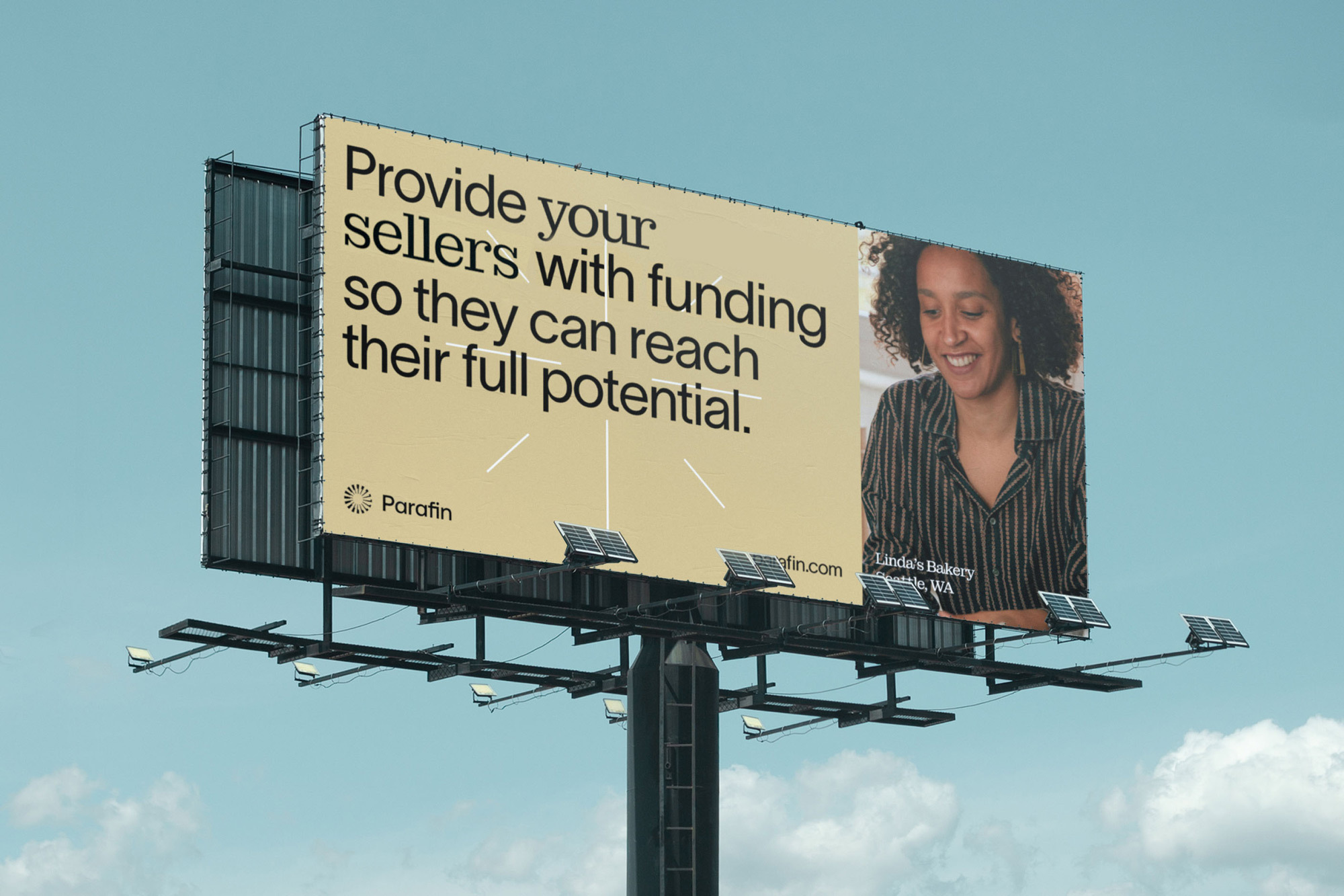
Alongside sister agency Manhattan Hydraulics, New York-based design and technology studio XXIX have positioned Parafin as ‘small business champions’ with their comprehensive rebrand for the financial platform. “Parafin’s business is aimed at providing platforms, such as DoorDash,” Designer Kate Doyle tells us, “with funding that small businesses can access.” Therefore, the brand holds both partners and businesses as equal audiences – an idea that is mirrored throughout the identity system. A prime example is the mint and gold-based colour palette that embodies a fresh, contemporary vibe, while individually celebrating the human warmth and cutting-edge nature of Parafin’s audiences. Parafin's reliability and expertise are no better communicated than through XXIX’s studious typographic choices. They “aim to communicate why Parafin is a trustworthy source of capital,” Doyle adds, “and ultimately, to communicate the larger project goal of empowering small businesses,” allowing them to reach their full potential. Opting for workhorse sans serif Lausanne from WELTKERN® and Florian Karsten’s slab serif Montagu as the diligent duo, Doyle details how their choices are firmly rooted in the brand’s concept, speaking directly to both its audiences. “Typographically, Lausanne provides utility through clean geometry and is hardworking for product and editorial use cases,” she explains, “while Montagu provides spirit through its traditional characteristics,” implemented across the small business owner-directed outputs. “When researching our options, we explored a number in the ‘antique’ and ‘ionic’ slab serif styles,” Designer Gene Hua adds, inspired by traditional 19th-century typefaces. “Montagu stood out as an inventive take on this genre,” he adds, praising the legibility and classic character it embodies at small scales, alongside the “not-so-subtle quirks” it inhabits as a display typeface. “Lausanne and Montagu have completely different origins,” Hua notes, “but when they sit next to each other, their similar x-heights and round shapes make them very complimentary,” effortlessly implementing the two interchangeably within headlines. “That way, a design could use one or the other for emphasis and speak to two audiences at the same time,” Hua suggests.


More Featured Inspiration

Students From Media Design School Redesign Kupu to Drive Everyday Use of Te Reo Māori by Eilish Neal , Scarlett Kang , Jayme Ducommun , Mehmet Gultekin , Jules Castillon

How Studio Dial turns tactile generative experiments into brand tools by Studio Dial

Fello by Bold Scandinavia

Ascent by Visual Journal Selection

Butterfly Cannon Blends the Worlds of Fine Wine & Whisky, With Their Creation of Glenmorangie’s Wine Cask Collection by Butterfly Cannon

Saxon Campbell on why side projects let designers be beginners again by Independent Studio
Looking to build an iconic brand identity or packaging?
US BRANDING STUDIO collaborates with ambitious founders, startups, and luxury brands to design distinctive visual identities, bespoke typography, packaging systems, and comprehensive design languages.