
Zware Jongens’ elegant identity for GIGANT allows the Belgian brewery’s beer to speak for itself
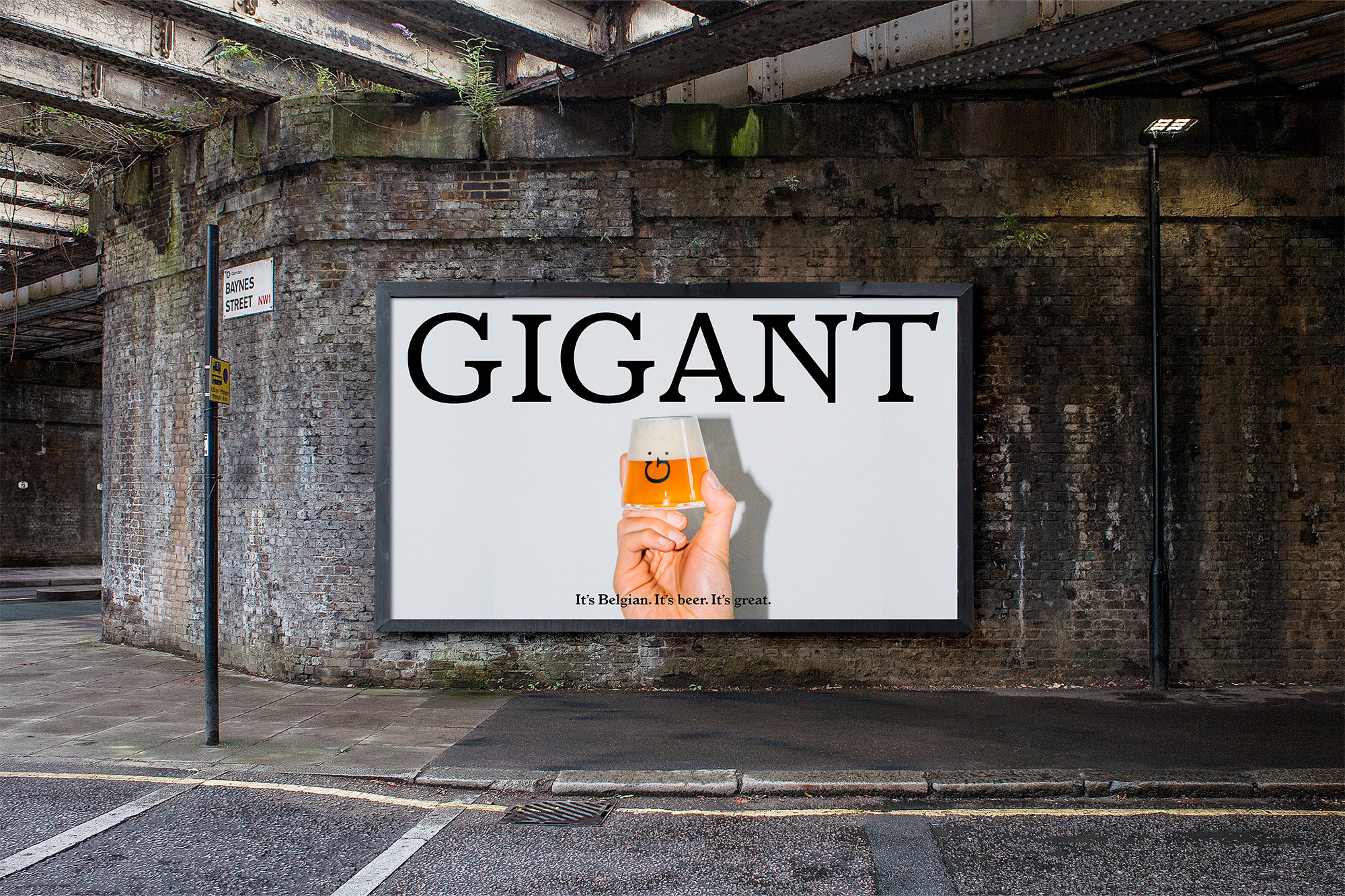
Belgian brewery GIGANT, the winners of seven medals at their inaugural World Beer Awards appearance, sought the help of Amsterdam and Antwerp-based creative studio Zware Jongens on the creation of their identity and packaging; the result of which is a candid and honest solution that doesn’t take itself too seriously. “The beer market is full of brands that are either very ‘sérieux’ or on the other hand, are trying to be funny,” Zware Jongens’ Founder Filip Janssen tells us, “we felt something lighter, simpler and more positive would work for GIGANT,” he adds, allowing the beer to speak for itself. This sentiment is carried throughout the design, which revolves around a simple yet striking typographic approach – with the studio opting for Frederic Goudy’s Italian Old Style, Grilli Type’s GT America Mono and Nicky Laatz’s Bon Vivant as the brand’s typeface trio. “We were actually looking for a timeless mix,” Janssen explains, “something that was made to last,” expressing a technicality and expertise through GT America Mono, a sense of heritage through Italian Old Style, and a playful character through the use of Bon Vivant. Together the typefaces both represent the brand’s values and provide the room to support one another, able to take on more decorative or more hierarchical roles when necessary.


More Featured Inspiration

Students From Media Design School Redesign Kupu to Drive Everyday Use of Te Reo Māori by Eilish Neal , Scarlett Kang , Jayme Ducommun , Mehmet Gultekin , Jules Castillon

How Studio Dial turns tactile generative experiments into brand tools by Studio Dial

Fello by Bold Scandinavia

Ascent by Visual Journal Selection

Butterfly Cannon Blends the Worlds of Fine Wine & Whisky, With Their Creation of Glenmorangie’s Wine Cask Collection by Butterfly Cannon

Saxon Campbell on why side projects let designers be beginners again by Independent Studio
Looking to build an iconic brand identity or packaging?
US BRANDING STUDIO collaborates with ambitious founders, startups, and luxury brands to design distinctive visual identities, bespoke typography, packaging systems, and comprehensive design languages.