
Octara Logo Design, Branding and Visual Identity System
Octara is a digital solutions brand built around the idea of integration, adaptability, and continuous growth. The visual identity reflects the brand’s ability to connect diverse digital capabilities through a unified and recognizable visual language. Inspired by the geometry of the octagon and the versatility of the octopus, the logo symbol represents structure, connectivity, and flexibility. Combined with a bold, contemporary wordmark, it creates a distinctive identity that balances geometric precision with a forward-thinking digital character. The color palette features Mystery Oceans as the primary color, bringing depth, confidence, and visual strength to the identity. Hera Blue introduces creativity and distinction, while Bleached Silk provides clarity and balance. Together, these col


More Featured Inspiration
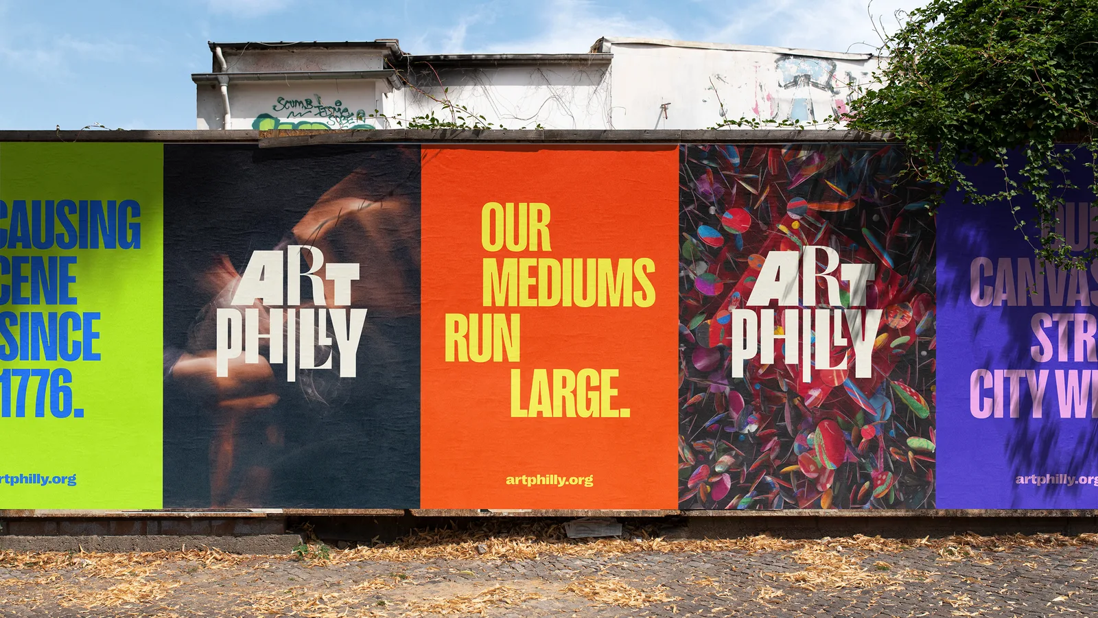
ArtPhilly by J2
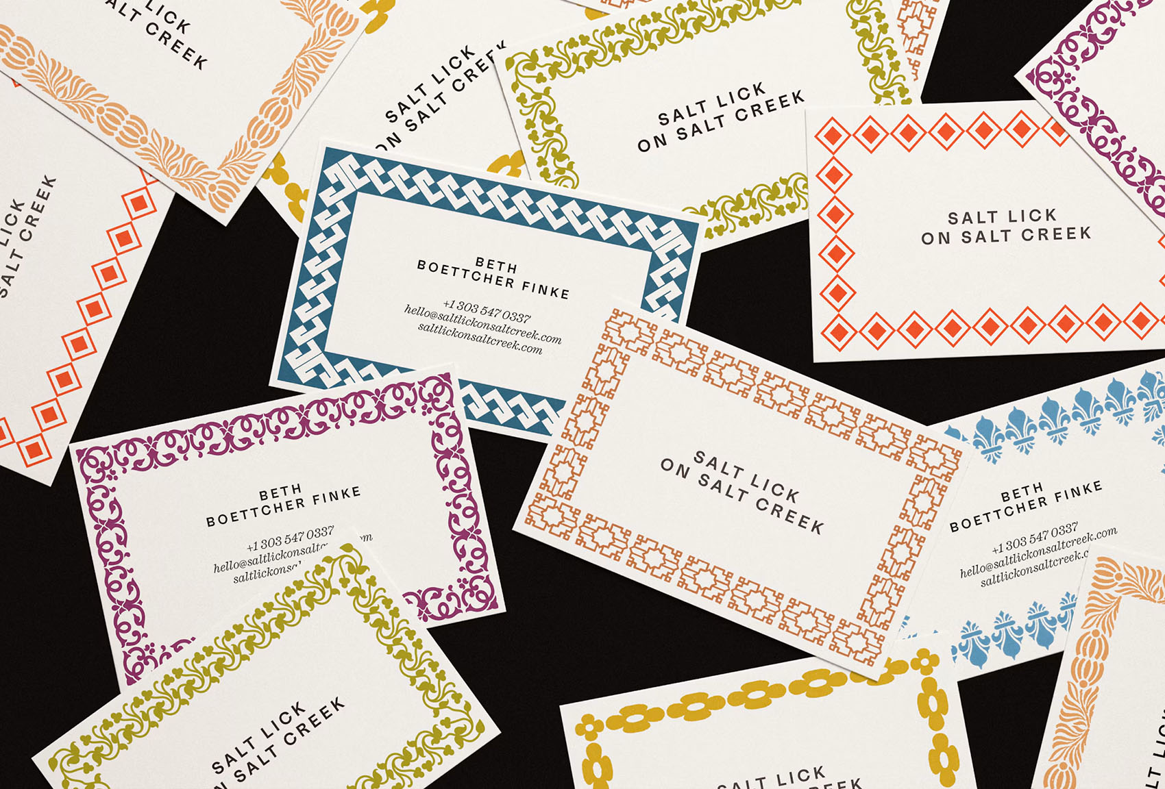
Salt Lick on Salt Creek by Visual Journal Selection

Amanauz Brand Identity for a Mountain Wellness Resort by DUGA® Real Estate Branding

Bangkok Insurance Rebrand, a Legacy Fit for the Future by Wonder And Work

The Cotton Club by Backbar Studios, Cocktails with Character by Backbar Studios Limited
TWIN Logo by Vadim Carazan
Looking to build an iconic brand identity or packaging?
US BRANDING STUDIO collaborates with ambitious founders, startups, and luxury brands to design distinctive visual identities, bespoke typography, packaging systems, and comprehensive design languages.