
Bureau Brut playfully combine marker pens and modernism for their sans serif typeface Round
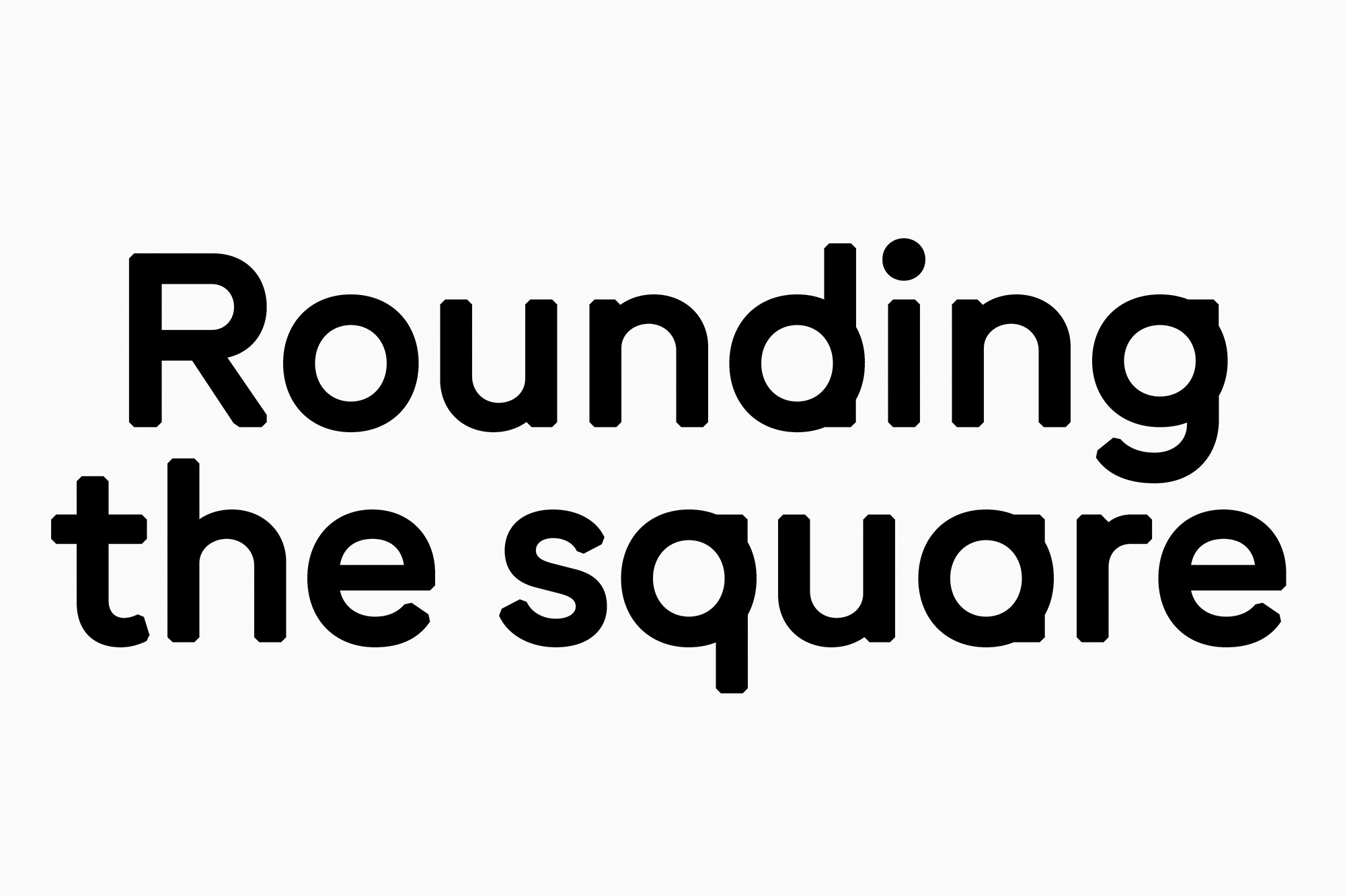
Montreuil-based type foundry Bureau Brut’s Round is here to question typographic convention; combining the physical appearance of a marker pen with a stark modernist construction. Making a genre of its own, Round doesn’t align directly with any one style or sub-category. “Geometry for abstraction, humanist for calligraphy,” Bureau Brut’s Yoann Minet explains, “Round is born in the tension between these two elements.” Originally sketched as a custom typeface for the Louvre’s Abu Dhabi exhibition in response to the theme of abstraction and calligraphy, the project was sadly not accepted. Excited by the project, however, Bureau Brut continued to develop it – thriving in toeing the line between Futura-esque geometric sans serifs and pure abstraction. “We decide to play just with the circle of round letters and keep the rest without contrast to have something that looks drawn in the same tool,” Minet explains, producing Round’s first version the very same way, alongside a variation in Arabic script. Beginning in December 2019, with one year to produce the idea, Minet recalls the desire to keep this duality between warmth and geometry. “This is why after different tests we decide to cut the angle,” he explains, finding the stark edges becoming magically soft and rounded when applied at the smaller size, and incredibly angular when more closely observed – with the specific angle proportional to the stems of the font weights. “We began the design with the Medium cut, and took a lot of time to define the right value for the corners,” Minet adds, “if you print this style, before 14pt you don’t really see the cutting corner, between 14pt and 24pt it looks rounded and above 24pt it’s visible.” Interestingly with a typeface developed from the concept of tools, its construction is without heavy contrast or obvious stroke. Wanting instead to maintain warmth and friendliness, Minet explains “we decided to have no contrast, with just a little for the optical adjustment, ending at 90° following the skeleton of the letters and the cutting corner.”


More Featured Inspiration

Students From Media Design School Redesign Kupu to Drive Everyday Use of Te Reo Māori by Eilish Neal , Scarlett Kang , Jayme Ducommun , Mehmet Gultekin , Jules Castillon

How Studio Dial turns tactile generative experiments into brand tools by Studio Dial

Fello by Bold Scandinavia

Ascent by Visual Journal Selection

Butterfly Cannon Blends the Worlds of Fine Wine & Whisky, With Their Creation of Glenmorangie’s Wine Cask Collection by Butterfly Cannon

Saxon Campbell on why side projects let designers be beginners again by Independent Studio
Looking to build an iconic brand identity or packaging?
US BRANDING STUDIO collaborates with ambitious founders, startups, and luxury brands to design distinctive visual identities, bespoke typography, packaging systems, and comprehensive design languages.