
How Smörgåsbord created a contemporary, multi-platform identity to unify the Ace creative family
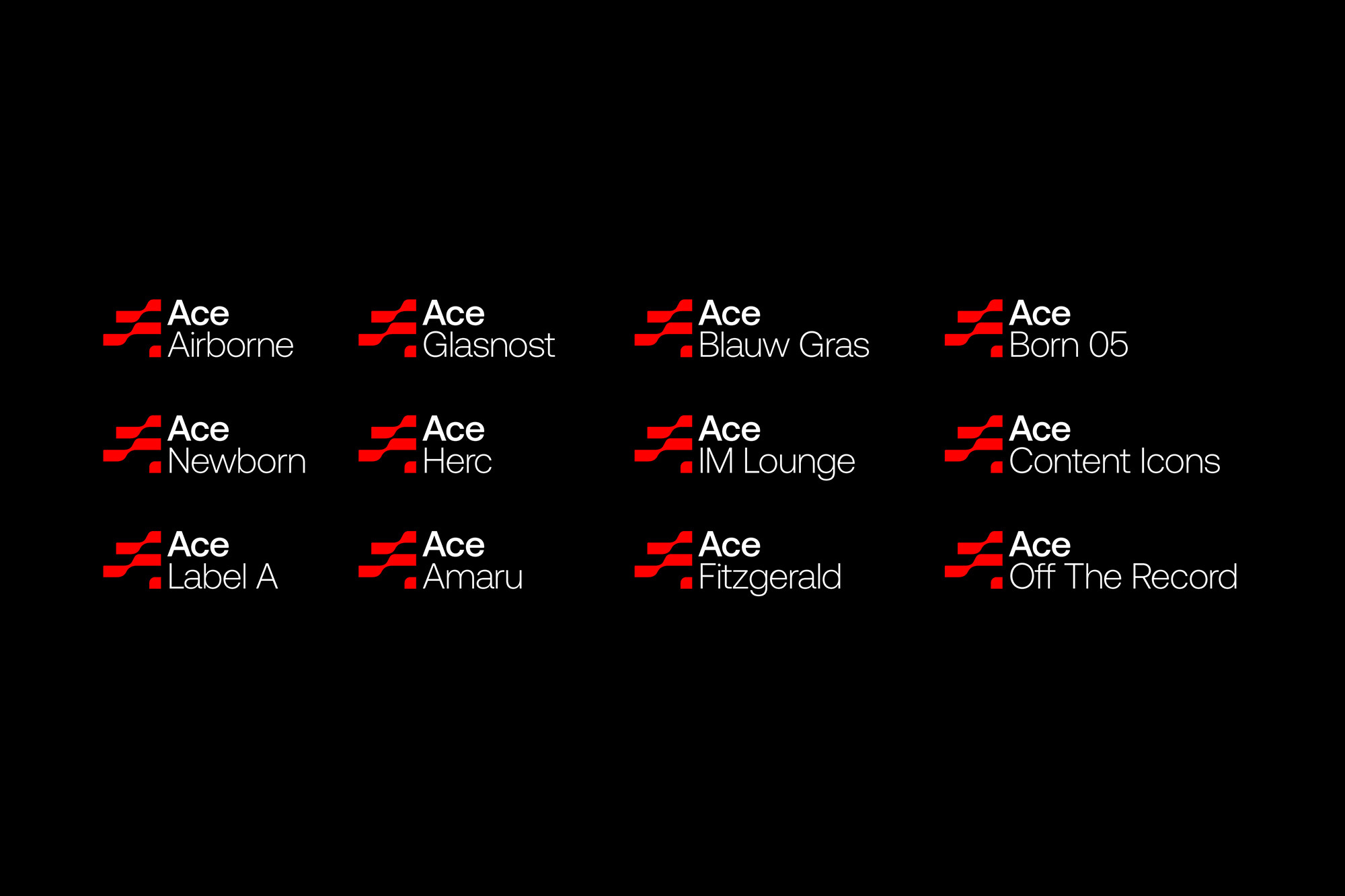
As its acronym would imply – Authentic, Cultural and Energising – Ace is dedicated to exciting and inspiring positive change. Consisting of several creative agencies, the advertising collective blends seasoned professionals and younger practitioners to help craft a better world for people, brands and society. In order to help Ace ‘make waves,’ creative studio Smörgåsbord, based in both the Netherlands and Wales, crafted a multi-layered strategy and identity. This central theme sits at the heart of the brand’s visual language across all outputs. First and foremost, the bespoke logo – made up of stacked, curvilinear stripes – communicates the fluidity and flexibility of the Ace moniker. The three stories that make up Ace’s new waterside HQ, and their exterior staircases, also informed the flowing ribbon-like treatment of the logotype and subsequent modular graphics. Putting the waves in motion, Smörgåsbord then developed motion graphics to demonstrate morphing between the three letters. During the seven-month project, the design team realised that this Ace ribbon marque was a perfect starting point for an all-over repeat pattern, introducing a heightened wave feeling whilst also serving as an effective backdrop. Contrasting the undulating forms of geometry, Smörgåsbord opted for CoType Foundry’s Aeonik as Ace’s structural workhorse typeface, designed to be timeless and versatile for future evolution.


More Featured Inspiration

Students From Media Design School Redesign Kupu to Drive Everyday Use of Te Reo Māori by Eilish Neal , Scarlett Kang , Jayme Ducommun , Mehmet Gultekin , Jules Castillon

How Studio Dial turns tactile generative experiments into brand tools by Studio Dial

Fello by Bold Scandinavia

Ascent by Visual Journal Selection

Butterfly Cannon Blends the Worlds of Fine Wine & Whisky, With Their Creation of Glenmorangie’s Wine Cask Collection by Butterfly Cannon

Saxon Campbell on why side projects let designers be beginners again by Independent Studio
Looking to build an iconic brand identity or packaging?
US BRANDING STUDIO collaborates with ambitious founders, startups, and luxury brands to design distinctive visual identities, bespoke typography, packaging systems, and comprehensive design languages.