
The Edit: five new projects including Shake-It by OlssønBarbieri
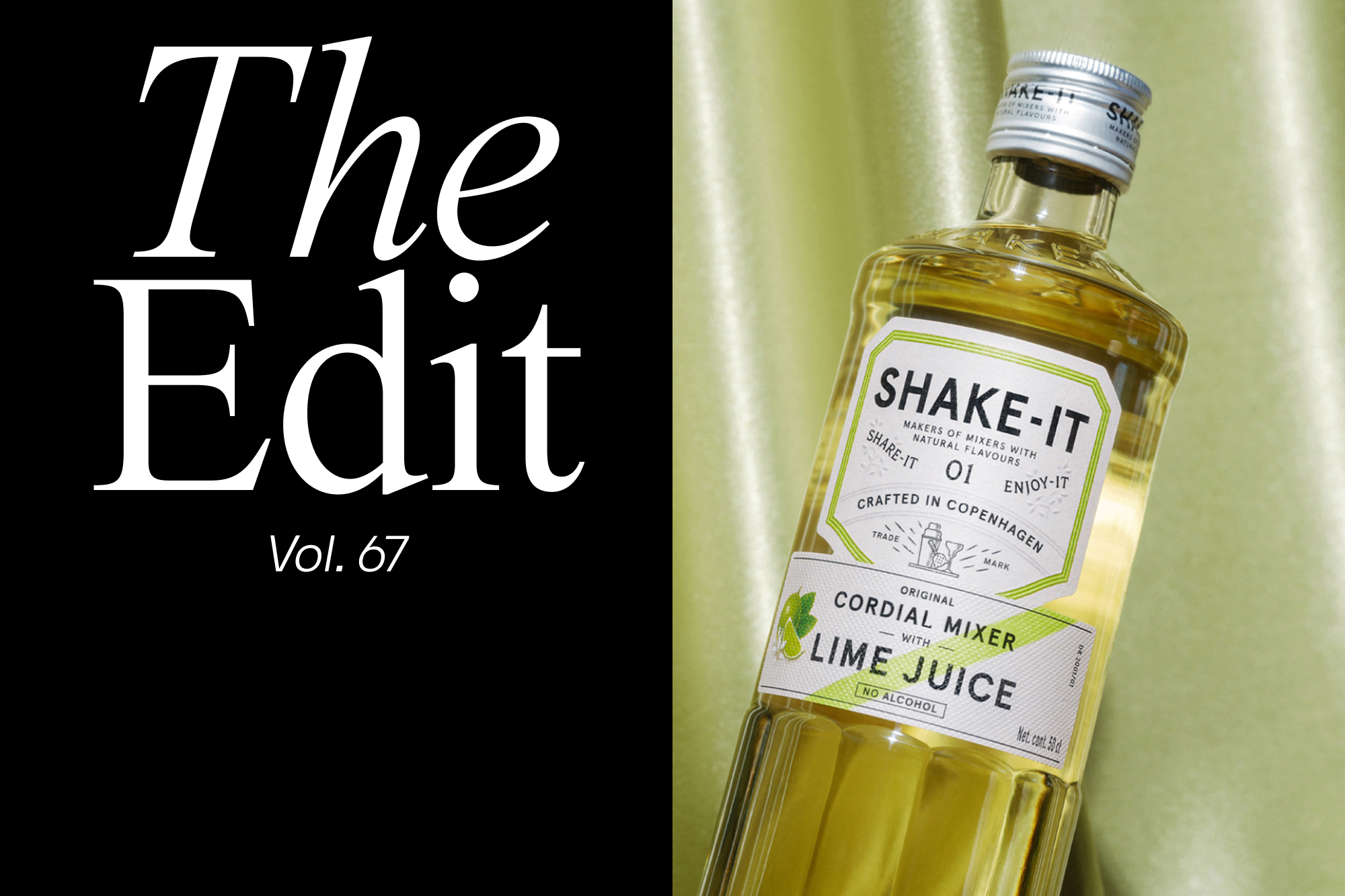
Each and every day, we're lucky to discover dozens of interesting and inspiring projects from around the world. From global identities and campaigns to side projects and independently published books, The Edit is home to five of them; every two weeks. First produced in Italian apothecaries during the Renaissance, cordials were originally alcoholic and seen as medicine in which herbs and spices were allowed to steep. Fast forward to today, however, cordials contain no alcohol and predominantly exist as sweet fruit-flavoured drinks. Enter Shake-It – a Nordic brand that’s repositioning cordials as a key ingredient in cocktail making, and in doing so, has already become the largest cordial mixer brand in Denmark. Taking on the design of Shake-It’s packaging, Oslo-based studio OlssønBarbieri identified the need to focus on quality and credibility alongside the brand’s relatively self-explanatory name. Inspired by the first bartender’s recipe book from 1862 as well as 19th-century medicinal labels, their concept aims to rekindle the legacy of mixing and restore pride to cordials in a cocktail making context. Working with Italian illustrator Irene Laschi, they devised a series of fruit illustrations to communicate the main ingredients of each product, as well as drink illustrations as a nod to the Italian aperitifs of the 70s. The bottle itself is inspired by vintage carafes, in reference to their association with hosting and special occasions, and classic glass juicers, due to their everyday usability. The design is capped by the sturdy application of Colophon Foundry’s Aperçu – a typeface choice that successfully anchors the bottle’s more playful and illustrative components. WW is an artistic collaboration between artist Katarina Wiklund and architect Susanna Wiklund, otherwise known as ‘WiklundWiklund.’ Working together for several years on art in public spaces, WW combines their expertise in visual arts, scenography, architecture and interior design; acting as an open place for experimentation and exploration. Created with the help of Stockholm-based design practice Studio Reko, ‘WW – Selected Works’ is a growing series of printed objects celebrating the duo’s creative output. Each publication summarises one project or several within the same discipline, with the aim to explore multiple formats, materials and techniques while maintaining a consistent visual expression.


More Featured Inspiration

Students From Media Design School Redesign Kupu to Drive Everyday Use of Te Reo Māori by Eilish Neal , Scarlett Kang , Jayme Ducommun , Mehmet Gultekin , Jules Castillon

How Studio Dial turns tactile generative experiments into brand tools by Studio Dial

Fello by Bold Scandinavia

Ascent by Visual Journal Selection

Butterfly Cannon Blends the Worlds of Fine Wine & Whisky, With Their Creation of Glenmorangie’s Wine Cask Collection by Butterfly Cannon

Saxon Campbell on why side projects let designers be beginners again by Independent Studio
Looking to build an iconic brand identity or packaging?
US BRANDING STUDIO collaborates with ambitious founders, startups, and luxury brands to design distinctive visual identities, bespoke typography, packaging systems, and comprehensive design languages.