
Whitman Emorson’s editorial identity for ENSEMBL sets them apart from their ‘stodgy’ competition
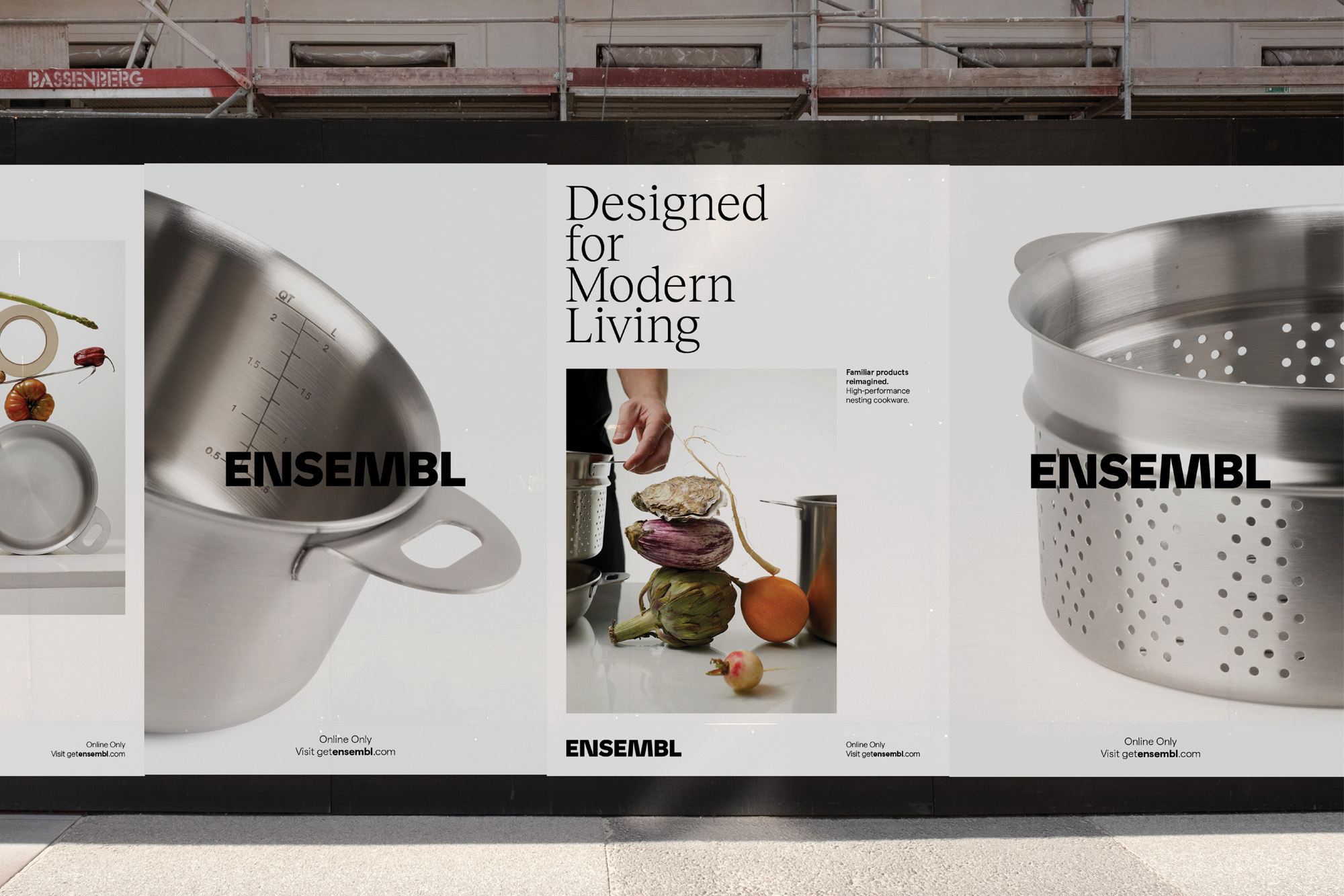
ENSEMBL are on a mission to provide premium kitchenware that is both functional and aesthetically-pleasing, creating a brand built to counter over-consumption and our disposition for disposal – with product lines designed to optimise available kitchen space. Needing an identity to match their mission, drive and aesthetic awareness, ENSEMBL turned to Whitman Emorson to take on the task. The Toronto-based design studio worked comprehensively across ENSEMBL’s brand, from its editorial strategy and brand positioning to visual identity and art direction. Reflecting the eclectic nature and humourful sophistication of the brand, Whitman Emorson have created a kitchenware brand unlike any other, cementing it on its own within the marketplace. Crafting a typographic-led identity, Whitman Emorson found an aesthetic strength through a dream-team of typefaces, utilising Klim Type Foundry’s Söhne Fett for the wordmark, and making use of Displaay Type Foundry’s Reckless and Matter as their supportive editorial type choices. Reconstructing the strokes of the ‘N’ and ‘M’ within Söhne to create a bespoke wordmark, Whitman Emorson designer Laura Soper explains “this reimagining of the familiar, reflected in the bespoke logo, is seen across ENSEMBL’s innovative product design approach,” especially with the stylistically antithetical supporting typefaces.


More Featured Inspiration

Students From Media Design School Redesign Kupu to Drive Everyday Use of Te Reo Māori by Eilish Neal , Scarlett Kang , Jayme Ducommun , Mehmet Gultekin , Jules Castillon

How Studio Dial turns tactile generative experiments into brand tools by Studio Dial

Fello by Bold Scandinavia

Ascent by Visual Journal Selection

Butterfly Cannon Blends the Worlds of Fine Wine & Whisky, With Their Creation of Glenmorangie’s Wine Cask Collection by Butterfly Cannon

Saxon Campbell on why side projects let designers be beginners again by Independent Studio
Looking to build an iconic brand identity or packaging?
US BRANDING STUDIO collaborates with ambitious founders, startups, and luxury brands to design distinctive visual identities, bespoke typography, packaging systems, and comprehensive design languages.