
Saint-Urbain’s appropriately vibrant brand for Ipanema brings Brazilian energy to Connecticut
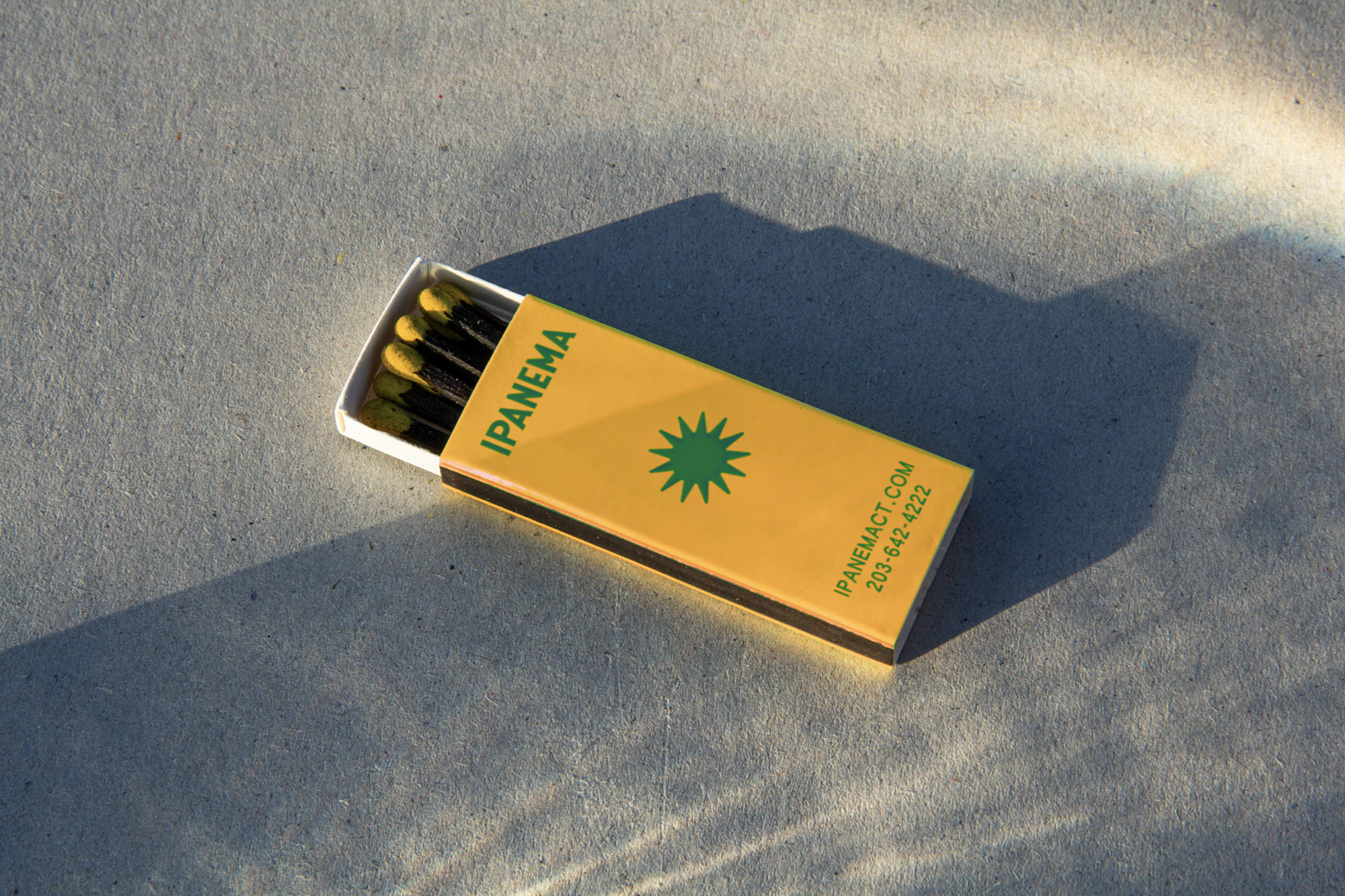
Within Little Brazil, Norwalk, you’ll find Ipanema; a four-decade-old family-run restaurant serving a mix of Brazilian and Portuguese food that has thrived as a result of the family’s roots. Paying homage to this rich history, and the loyal customers that have grown alongside it, NYC-based creative agency Saint-Urbain have designed a fresh identity for Ipanema – keeping their heritage and kinship in mind, alongside the bustling retrospective inspiration of Brazil’s Rio De Janeiro during the 1970s. With everything from the identity’s joyful colours, vivid patterns, soft typography and sun-kissed symbol; Creative Director of Saint-Urbain Alex Ostroff explains “our inspiration couldn’t be simpler,” finding all they need in the vibrancy of Brazil – finding the rarity of Brazilian restaurants in Connecticut an opportunity to push what is expected. With a distinctly vintage feel, Ostroff explains their intention for keeping a sense of nostalgia, as well as looking forward. “It’s vintage, paying homage to the history of this family-owned business,” he explains, “but it’s also modern, which the son, who’s in his late 20s, was hoping for.” This is most obviously demonstrated in Saint-Urbain’s typographic treatment, using a typeface synonymous with the advertisements and magazines of Brazil during the 1970s. “It also has a bit of deco’ness,” Ostroff adds, something powerfully exemplified in the patterns applied across the identity. “Brazil has these insanely iconic, rhythmic, and beautiful beach boardwalk sidewalk patterns,” Ostroff recalls, finding a pleasing harmony between the pavements and the typical 70s funk found within most graphic and fashion design of the decade. Cleverly using these as a supportive element to the text, and a bolstering aspect to the colour palette, the mesmerizing patterns inject a playful soul to the brand; allowing itself to be lively, colourful and jovial amongst a sea of monochromatic, minimalist restaurant identities.


More Featured Inspiration

Students From Media Design School Redesign Kupu to Drive Everyday Use of Te Reo Māori by Eilish Neal , Scarlett Kang , Jayme Ducommun , Mehmet Gultekin , Jules Castillon

How Studio Dial turns tactile generative experiments into brand tools by Studio Dial

Fello by Bold Scandinavia

Ascent by Visual Journal Selection

Butterfly Cannon Blends the Worlds of Fine Wine & Whisky, With Their Creation of Glenmorangie’s Wine Cask Collection by Butterfly Cannon

Saxon Campbell on why side projects let designers be beginners again by Independent Studio
Looking to build an iconic brand identity or packaging?
US BRANDING STUDIO collaborates with ambitious founders, startups, and luxury brands to design distinctive visual identities, bespoke typography, packaging systems, and comprehensive design languages.