
Balense’s identity, by Willow & Blake, turns balance into a system
Balense® is a clinical skincare range that was born at Australian Skin Clinics. It had lived only as a product inside that clinic group, but GM & Brand Director Nicola Kropach had bigger ambitions to reformulate it for Gen Z. “I knew there was genuine brand equity in the Balense® name that we had never had the right partner to articulate properly,” she tells us. Melbourne-based creative branding agency Willow & Blake was commissioned to turn that strategic vision into a visual and verbal identity, with a complete set of brand guidelines. “I already had the packaging concept locked in; what I needed was agency expertise to translate our brand codes onto pack.” Willow & Blake’s executed the naming, colour and typographic approach that put the brand onto the range’s 24 SKUs, each a separately stocked product. Balense’s earlier packs leaned towards stark white and clinical silver. Kropach found the original packaging clinical and dated, making it hard for shoppers standing at a shelf to choose for themselves. Since its phased relaunch began in July 2026, the brand has grown 53% year on year. The range is also stocked beyond its original home, at SILK Laser Clinics and Atomica stores as well as Australian Skin Clinics. “The philosophy behind the brand is balance – it’s literally in the name,” explains Willow & Blake’s Creative Director Bri Nixon. “Once we’d identified this guiding idea, it became a test for every creative decision.” The agency’s strategy started from Balense’s dual commitment to effective results for the skin and confidence for the self. “An architect works with a combination of precision and creativity. The Skincare Architect is the name of the archetype behind our copywriting’s tone of voice. She is effortless, empowering, authoritative,” she notes. The archetype shaped the design system, as “a set of rules that give strong structure with room for personality on top.” The product names follow a formula of a made-up word plus the product format, as in Energee Day Serum, Plungee Hydrating Moisturiser and Soakee Hydrating Serum. “This mirrors the ethos behind all our brand decisions: balancing hardcore science with creativity,” Nixon details. The agency also created the suffixes that end each made-up word. “We relied on our copywriting sense of how certain phonics make someone feel. For example, the -ee suffix sounds like the squeak of water,” she explains. “The -ini suffix gives the idea of something precious and glowing, with names like Glowtini Brightening Exfoliant, Plumpini Repair Moisturiser and Lumini Night Serum. These are not names you’d typically expect from a clinical skincare brand.” Balense’s copy leans on a repeated ‘X meets Y’ framework, such as ‘Science meets Simplified.’ “Our approach balances complex clinical language and Gen Z colloquialisms. SCIENCE carries the clinically backed information while SIMPLIFIED is for the skim reader. It respects the intelligence of each Balense® customer,” Nixon tells us. The minimalist sans serif wordmark sits alongside an icon of four looping petals in symmetry. In place of the old packs’ white and silver, the brand colours are bespoke gradients in pearl, pool, oyster, champagne and chalk, each representing a skin concern. “Introducing colour was the key unlock, giving customers an intuitive way to navigate the range themselves,” Kropach notes. “On shelf, the packaging has to do all the work of communication and differentiation in seconds.” Nixon adds that “all five colours are inspired by nature and sit in one tonal family. They share the same soft gradient texture, so each pack works alone while still reading as one brand.” The typography pairs Avenir Condensed with Colophon Foundry’s sans serif Aperçu in its Regular and Mono cuts, the Mono being monospaced so that every character takes the same width. “As an amalgamation of early 20th-century sans serifs, Aperçu had the pedigree to handle large swathes of text while retaining enough idiosyncrasy and detail to stand out in market,” Nixon details. “On pack, the pairing of regular and monospaced cuts created hierarchy and readability through decidedly minimal means, allowing the gradients to shine. With limited space on pack and often long product names, Avenir Condensed answered a practical need while becoming a more expressive part of the identity. Compact and legible at product scale, it can expand into bold campaign headlines and deliver copy with impact.” Ranging from 35ml to 200ml, the packs all had to look cohesive on shelf and online. “We started with the hardest case: the serum. Its vessel and outer box have the longest copy across the smallest 35ml packaging format. Through trial and error, this established the limits of a system and a structure that could scale confidently up to 200ml,” Nixon tells us. “From there, each section of text was carefully typeset across all 24 SKUs, maintaining a consistent hierarchy while accommodating different formats, product names and copy lengths.” Willow & Blake Balense®


More Featured Inspiration
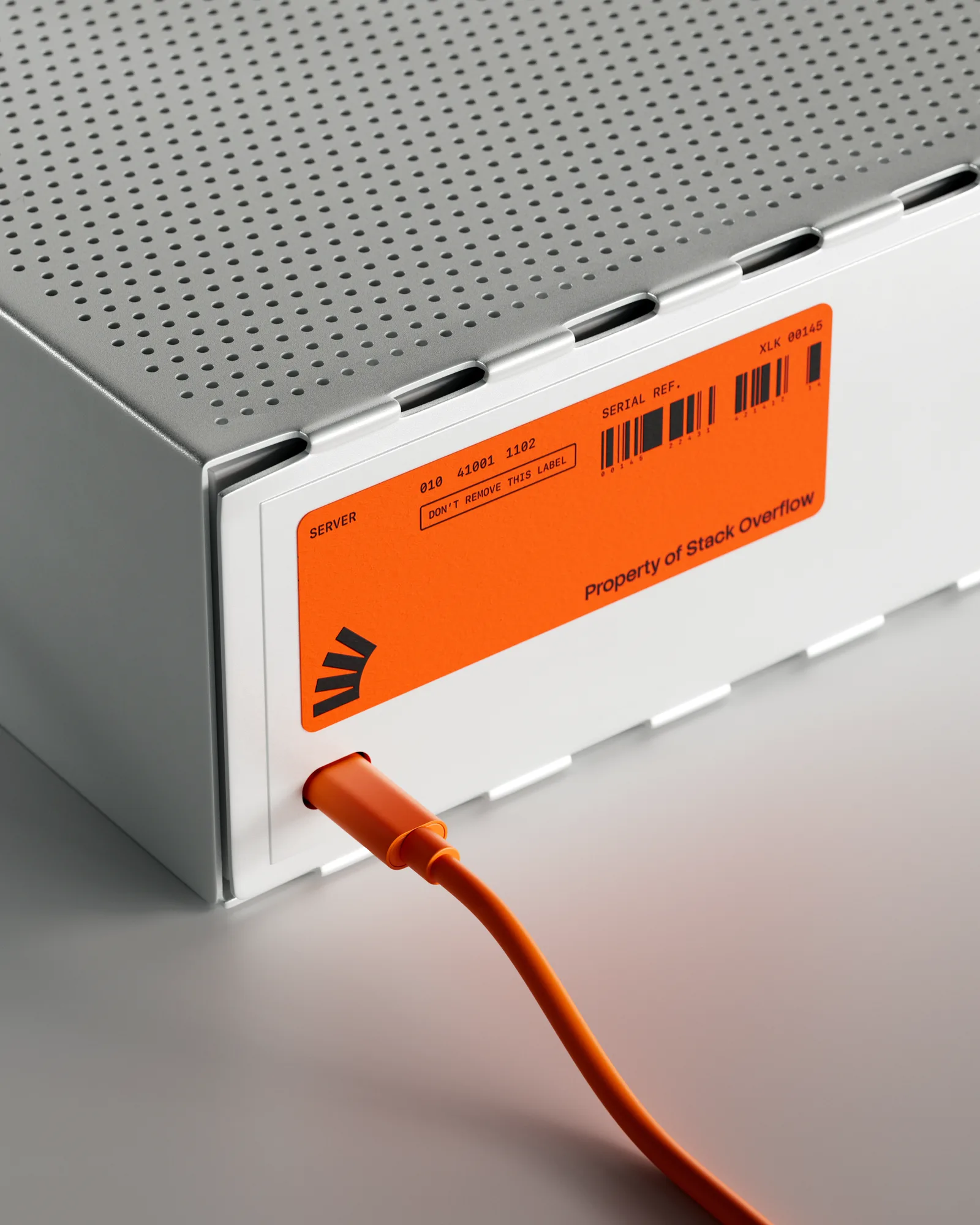
Stack Overflow by Koto

Estudio Cariño invents HOUSE of CALLAGHAN, an Irish stout brand by Estudio Cariño

Polar is its own client at P.A.C., an artisanal bakery in São Paulo by Polar

Agrumea Farm Packaging for a premium savoury line by Studio K95

Barkas shares distinctive new identity for Nigerian digital bank Kuda by Barkas

JDO Takes Non-Alcoholic Luxury to the Global Stage with Hyve by JDO Global
Looking to build an iconic brand identity or packaging?
US BRANDING STUDIO collaborates with ambitious founders, startups, and luxury brands to design distinctive visual identities, bespoke typography, packaging systems, and comprehensive design languages.