
Why Carolanebel Studio turned a fleur-de-lys into a bird for Club Pays
Club Pays is a café on Montréal’s Plaza Saint-Hubert that becomes a room for shows, open mics, reading circles and talks in the evening. It is run by OUI Québec, a non-partisan umbrella organisation for the Québec independence movement, and its model comes from the casals of Catalonia and the herriko tabernas of the Basque Country – citizen-run bars that work as meeting places, mobilisation centres and fundraisers. Surpluses from Club Pays’ coffee, beer and events go back into the movement. Montréal-based Carolanebel Studio was commissioned to design the space’s identity. OUI Québec has worked with the studio’s Founder & Creative Director, Carolane Bélanger, for nearly five years, and gave her full creative freedom on Club Pays. “Politics and independence can sometimes feel intimidating, so our goal was to create an inviting atmosphere where anyone would feel at home, while maintaining a bold, contemporary edge,” explains the organisation’s Communications Manager Alex Valiquette. Bélanger names three reference points for the identity: the popular poster, the neighbourhood café and the Québec of today. “For the latter, I wanted to take something deeply rooted in Québec, like the fleur-de-lys, and reinterpret it through a more contemporary, open and lively visual language,” she tells us. A symbol of the French presence in North America, the fleur-de-lys has been on the Québec flag since 1948. In earlier work for OUI Québec, Bélanger had already played with turning it into a bird, but she wanted Club Pays to have a symbol of its own. “The fleur-de-lys represents Québec, while the bird represents freedom and independence, the idea of spreading your wings and finding your own way,” she notes. Her symbol for Club Pays is a bird drawn in the shape of a fleur-de-lys, moving forward with a flower in its beak. Working in pencil on paper, Bélanger drew the logotype and the bird, tracing over her sketches again and again on a light box until she reached the final versions. She then scanned them and refined the lines in Adobe Illustrator to make the identity functional and easy to use, “while being careful not to polish away the character of the original drawing,” she details. The logotype started from the Blueberry Script typeface, which she reworked by hand through the same process, redrawing and modifying several of its letterforms, changing curves and angles, and creating new characters where needed. “You might see the bird first and the fleur-de-lys a moment later, but I wanted both forms to coexist naturally within the same silhouette,” Bélanger explains. “I started with the general shape of the fleur-de-lys and drew the bird within it, almost like sculpting one form out of another.” She drew the bird with the curves and angles of the logotype as a reference, so the two have the same visual language. “The final drawing may feel naïve and spontaneous, but there is a lot of structure and attention to detail behind it,” she adds. Alongside the logotype, the secondary typeface is Wilden, whose bold, rounded shapes share some of the curves and softness of the hand-drawn elements. Bélanger also liked “the contrast between Wilden’s more solid, structured presence and the organic, imperfect quality of the drawings and logotype. That contrast gives the identity more rhythm and helps the hand-drawn elements stand out, while providing a clear and versatile typeface for the information around them,” she tells us. OUI Québec encouraged Bélanger to be bold with colour and explore unexpected choices rather than lean on what people might immediately associate with Québec, especially the blue of its flag. While the palette she landed on still includes a blue, it’s set beside burgundy, orange-red and warm beige. No colour has too rigid a role, so the combinations can shift depending on the application. “The burgundy and orange-red bring a lot of warmth and intensity, while the blue creates a more unexpected contrast and the beige softens the whole palette,” she explains. For Valiquette, the identity’s bold approach “signals a place where we’re not afraid to break the codes and redefine what the Québec independence project can be.” The influence of the popular poster, the first of Bélanger’s three reference points, is in the bold typography, strong contrasts, simple compositions, grain and hand-drawn imperfections. “I wanted to create visuals that could almost be pasted up everywhere, something you can see quickly, recognise and understand without it feeling overly polished or institutional,” she notes. “At the same time, Club Pays is also a neighbourhood café, so the identity needed warmth and familiarity. It had to feel just as natural on a coffee cup or a t-shirt as it does on a poster for an event. That everyday quality helps balance the stronger, more civic side of the visual language,” Bélanger concludes. Carolanebel Studio Club Pays


More Featured Inspiration
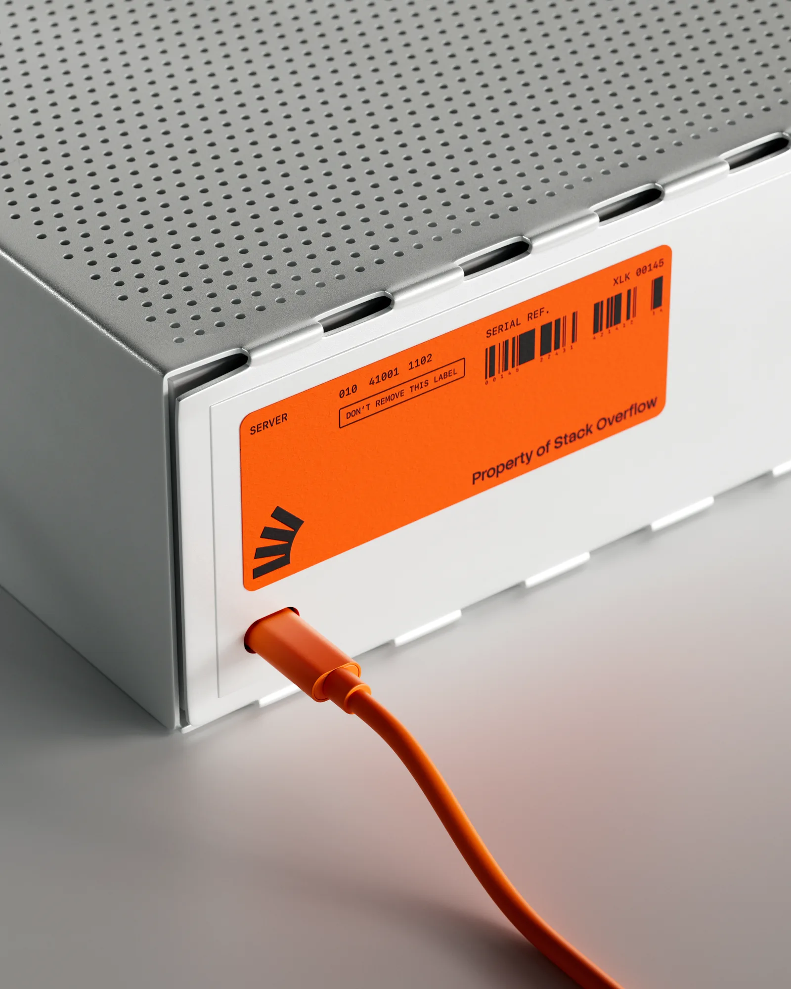
Stack Overflow by Koto

Estudio Cariño invents HOUSE of CALLAGHAN, an Irish stout brand by Estudio Cariño

Polar is its own client at P.A.C., an artisanal bakery in São Paulo by Polar

Agrumea Farm Packaging for a premium savoury line by Studio K95

Barkas shares distinctive new identity for Nigerian digital bank Kuda by Barkas

JDO Takes Non-Alcoholic Luxury to the Global Stage with Hyve by JDO Global
Looking to build an iconic brand identity or packaging?
US BRANDING STUDIO collaborates with ambitious founders, startups, and luxury brands to design distinctive visual identities, bespoke typography, packaging systems, and comprehensive design languages.